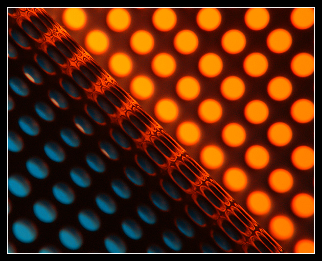
Using the same yellow and blue beakers as used for the Secondary Colours challenge, but this time put them inside a couple of metal pen holders (as seen in my Rhythm entry) and lit them from behind.
A warming filter turned the yellow to orange, a +4 closeup lens got me, erm, close up, and the camera was tilted 45 degrees on the tripod.
Statistics
Place: 5 out of 82 Avg (all users): 6.7273 Avg (commenters): 7.8750 Avg (participants): 6.7241 Avg (non-participants): 6.7308 Views since voting: 2568 Votes: 110 Comments: 19 Favorites: 2 (view)
*Critique Club*
You are one tough cookie to comment on. Your work is so great. I feel bad about not being able to suggest ways of improvement, but maybe that's a good thing?
I like how the blue and orange colors are fuzzy and the holes in the pencil holder in front are nice and focused on the diagonal.
I really like the angle and framing/cropping, the way that the strong diagonal seperates the photo, but not right in the dead center, is really visually appealing to me.
The colors are definately complimentary, definately fitting into the challenge. These "beakers" really are a handy tool. I'd be interested in seeing what they look like when they aren't being glorified.
What a very creative idea, and very well executed. Congrats!
~Heather~
Here is my two cents.
It meets the challenge.
The focus point seems to be on the grade.
Both colors look out of focus and it disturbs me.
I like the positioning of the grade in respect to frame.
The white border seem to take away from photo for me.
=5
pretty good, i like the symmetry of the line cutting the frame in an untraditional half, good complements of the blue and orange, interesting how the focus played in the middle, the forground side of the line tack focus and the orange side a bit blurred
I believe having seen an image in this vein at dpc before. It was a cheese grater i believe. Don't know what gadget this is but it results in a pleasing, artistic image. Like the tonality and how the light falls on the middle or edge of the whatchamecallit. Artistic. 8
good use of strong color... good job with the exposure as well... this makes a good abstract, and I also like the fact that you didn't let the diagonal split the frame in each corner... that is a good compositional strength in this photo... = 7





 Add photograph to your favorites
 Add photographer to your favorites

 Photographer found comment helpful.


