| Author | Thread |
|
|
05/29/2003 01:28:51 PM |
FROM THE CRITIQUE CLUB
Hi, Wanda,
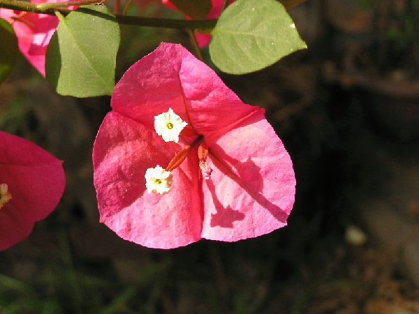
Your first entry! And you went with a flower macro, that's GUTSY! Your kids/husband must love you a lot. In Argentina, where I grew up, we called this flower "Santa Rita". It's one of my favourites, but in Canada it doesn't grow outdoors.
Your entry meets the challenge, although arguably the "red" is actually a "dark pink". On first impression, the photo looks very clear, but it doesn't show enough detail because of the angle at which you placed the flower, and the hard light.
Focus: Very good, in particular around the edges of the flower petals.
Lighting: A bit of a problem in this photo. Even though the light comes from the top left and not from right above, it is a bit harsh (as your commenters below pointed out already). A couple suggestions are to take the picture from a different angle, or maybe later in the day, or to block the direct light (e.g. with a piece of white paper).
Composition: A direct from the top approach can be quite dramatic, but IMO in this case it doesn't do justice to the beauty of this flower. I think your idea to include the leaves is very good. Maybe you could try taking a view from the side of this flower, with leaves right behind it, kind of cradling it, maybe even a cluster of flowers.
The fainter flowers behind the petals are OK, but the one petal to the left is distracting. Same goes for the spots to the right hand side of the picture. Maybe closing in to the flower a bit more to better fill the space would give you a good shot. Something to try :)
Overall: Pretty good, especially for a first attempt at close-ups. Keep going! I'm looking forward to seeing more of your pictures.
Ursula (uabresch)
Questions, comments, complaints ... feel free to contact me.
|
|
Comments Made During the Challenge  |
|
|
05/25/2003 11:43:53 PM |
|
Very interesting flower. I like how the two leaves add informality to this image. Lighting seems a bit harsh. |
|
|
|
05/23/2003 11:29:37 PM |
|
the Lighting is to harsh. use a diffuser in to block the direct sunlight if you can. |
|
 Photographer found comment helpful. Photographer found comment helpful. |
|
|
05/22/2003 11:38:55 PM |
|
the lighting is a bit harsh. |
|
| Photographer found comment helpful. |
|
|
05/22/2003 02:15:25 PM |
|
Very pretty, and definitely fitting the 'complementary' part. An angle that overlapped leaf and flower would have been even nicer. |
|
| Photographer found comment helpful. |
|
|
05/21/2003 01:05:02 AM |
|
I like the shadow on this -- it adds some interest to the shot, and the depth of field you have chosen is nice as well. Overall, though, I think the lighting is a bit harsh and is causing some of the lighter spots to blow out or look over exposed. |
|
| Photographer found comment helpful. |
|
|
05/19/2003 07:34:37 PM |
|
good subject choice but a better background is really needed to help this out. Strong sunlight doesn't help the composition either as it has made this really contrasty. |
|
| Photographer found comment helpful. |
|
|
05/19/2003 03:49:59 PM |
|
This is a nice looking macro shot. |
|
| Photographer found comment helpful. |
|
|
05/19/2003 10:34:37 AM |
|
your DOF is good, but the lighting is too harsh. It does not really meet the challenge too well because the red looks quite pink. Next time try shadowing the flower with a piece of paper, or taking it at a different time of day. |
|
| Photographer found comment helpful. |
|
|
05/19/2003 09:36:13 AM |
|
It's kind of pixelated, which makes it look out of focus (or made out of tiny lego). |
|
| Photographer found comment helpful. |
|
|
05/19/2003 09:19:03 AM |
|
challenge met, bu tthe lighting here is a bit harsh... a good bit of detail is being eaten by the light... = 5 |
|
| Photographer found comment helpful. |
|
|
05/19/2003 12:17:06 AM |
|
Excellent shot, the lighting just seems a bit too harsh. |
|
| Photographer found comment helpful. |
Home -
Challenges -
Community -
League -
Photos -
Cameras -
Lenses -
Learn -
Help -
Terms of Use -
Privacy -
Top ^
DPChallenge, and website content and design, Copyright © 2001-2026 Challenging Technologies, LLC.
All digital photo copyrights belong to the photographers and may not be used without permission.
Current Server Time: 06/30/2026 10:08:07 PM EDT.