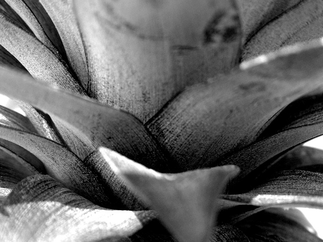
Great textures and contrast. About the only suggestion I have to offer is that maybe a composition a less centered composition, one with the lower mostly out of focus leaf further in the lower right corner, would be something to try.
Trying to figure out which part of this image should be in focus was probably a beast, so you'll certainly hate me when I say that I don't like the big, dominant leaf in the top middle so out of focus. Your use of contrast for texture is great.
Good textures, sharpness (in the middle ground) and tones, but too many oof elements in the fg makes it hard for me to look at. The leaves at top, bottom, L & R seem to emerge from the frame in a way that makes me want to blink to avoid being poked in the eye. This effect can be useful, but I don't think it works here.
Some great detail and shapes to look at here, but the depth of field is distracting. It doesn't really seem to add depth, it just creates a strange distortion.
This is a nice view, but a difficult one to get the good depth of field on... on a shot like this, I think it is easier to back away from the subject and use the zoom at it's highest potential to really get the best depth of field....






 Add photograph to your favorites
 Add photographer to your favorites


