| Author | Thread |
|
|
05/22/2003 03:06:42 PM |
*Critique Club*
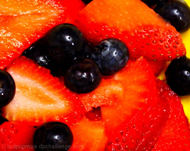
This hurts my eyes. I think the saturation is too high or something. The red seems a bit TOO red. The berries aren't really blue. Most of them seem black or deep purple.
I think that they yellow plate would be effective had we been able to see a bit more of it.
The focus seems a slight bit soft to me, and that is probably due to the closeness or the overly bright reds.
It looks delicious, don't get me wrong. lol
I think that if you backed up a bit, maybe tried some different lighting so the reds wont be SO red, this would be a great comercial shot. I dont think that lowering the saturation would work well. You could try it, but it might make it look dull then.
~Heather~ |
|
 Photographer found comment helpful. Photographer found comment helpful. |
Comments Made During the Challenge  |
|
|
05/17/2003 11:24:11 PM |
|
Maybe pulling back a little more would help you to get more of they yellow and the focus on the berries would be stronger. |
|
| Photographer found comment helpful. |
|
|
05/16/2003 06:50:08 AM |
|
I only have one word for this "yummy". Oh and your pic is very good too :-) |
|
| Photographer found comment helpful. |
|
|
05/15/2003 04:06:42 PM |
|
The lighting and saturation on this shot, combined with the very soft focus (or overprocessing, depending how you got the effect) on most of the strawberries, combines to make me think my glasses aren't on straight. The colors might have been better contrasted by a not-yellow plate, something to make it clear there IS a white or non-red value somewhere in the frame. Just thinking out loud. :-> Also, the composition's kind of ... all over the place. There's no one place the eyes are drawn or directed, no center of attention. |
|
| Photographer found comment helpful. |
|
|
05/13/2003 02:46:47 PM |
|
| Photographer found comment helpful. |
|
|
05/13/2003 10:30:04 AM |
|
| Photographer found comment helpful. |
|
|
05/12/2003 08:38:40 AM |
|
The blueberries might be more, well, blue, they seem to dark. Good idea though |
|
| Photographer found comment helpful. |
Home -
Challenges -
Community -
League -
Photos -
Cameras -
Lenses -
Learn -
Help -
Terms of Use -
Privacy -
Top ^
DPChallenge, and website content and design, Copyright © 2001-2026 Challenging Technologies, LLC.
All digital photo copyrights belong to the photographers and may not be used without permission.
Current Server Time: 06/28/2026 11:20:43 PM EDT.