| Author | Thread |
|
|
03/25/2006 06:36:36 PM |
|
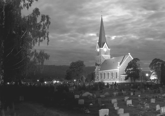
I also like this shot better than the color version. Have you tried what SJCarte suggested? I think if you edit in Photoshop and bump the contrast up a little and take the brightness down it will pop and also give it a spooky feel with the graveyard. Nice image. |
|
 Photographer found comment helpful. Photographer found comment helpful. |
|
|
02/15/2006 07:32:55 PM |
|
I like this one too, but feel like there could be a little more contrast. The tonal range isn't quite what it was in color - something that I think could be corrected/improved in PP with a little tweaking. Still, a good shot in B/W too. |
|
| Photographer found comment helpful. |
|
|
09/24/2005 06:31:18 PM |
I like this better than to color one. It seems more wistful.
Message edited by author 2005-09-24 18:31:31. |
|
| Photographer found comment helpful. |
|
|
07/25/2005 12:20:03 PM |
|
This is a nice shot. I would crop the left hand portion a bit and see if I could still get a balanced shot out of it. |
|
| Photographer found comment helpful. |
Home -
Challenges -
Community -
League -
Photos -
Cameras -
Lenses -
Learn -
Help -
Terms of Use -
Privacy -
Top ^
DPChallenge, and website content and design, Copyright © 2001-2026 Challenging Technologies, LLC.
All digital photo copyrights belong to the photographers and may not be used without permission.
Current Server Time: 07/16/2026 02:00:50 PM EDT.