Author Thread
Post actions
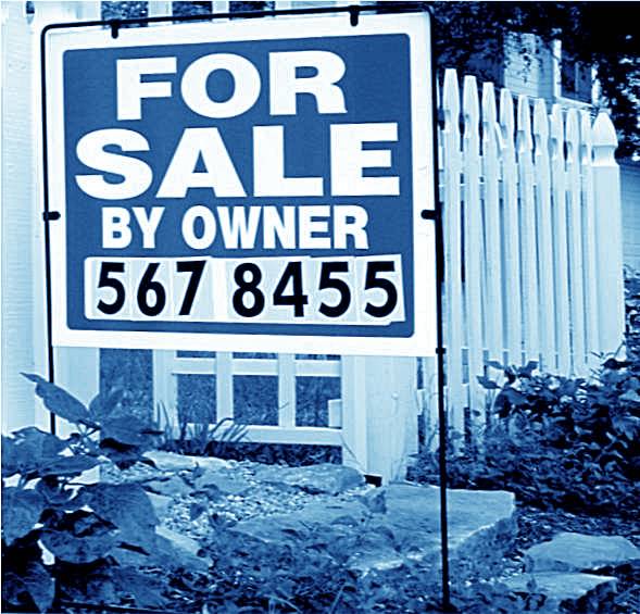
Great take on the challenge and I do agree with the title but not sure about those blue tones?
Post actions
here here. We don,t like these people here either. We call them estate agents (license to print money ...gits!!)
Post actions
Thanks for your comments, folks. I worked and worked on this and the only filter that didn't look odd was blue. I have no idea why. I'm still learning the editing tools, so this was a learning experience and I liked the idea for the challenge.
Post actions
I would have liked to see it sharper and less blue. The concept matches the theme beautifully.
Comments Made During the Challenge
Post actions
I think a more sharp would have worked better. Especially more crisp text on the sign.
Post actions
The whites are very blue. I don't know if that was intentional, but I don't think it helps the picture very much. Nice concept.
Post actions
Post actions
Post actions
I think a b&w or duotone (other than blue) would have worked better here.
Post actions
dislike colour, good idea
Post actions
Understand the sentiment but little wow factor in this shot. The desaturation has not added anything to the pic IMHO. Sorry, good luck
Post actions
the color doesn't do anything for me
Post actions
I like how the FOR SALE sign jumps out me. It makes me feel like the owners are desperate to become independent from this house. The white picket fence is nice as well. Small town USA feeling. The blue hue is different. I can see how it works though.
Post actions
I get your meaning here. I'm not real keen on the blue color cast - I don't know if it was intentional or your white balance was off.
Post actions
My favorite for this challenge, best take on independence I've seen
Post actions
I love the idea, but I am not sure I like the blue tint. Still, 6.
Post actions
Very cute and creative idea! Love the title, and there's something about the picture that I really love too. I'm a sucker for the blue tones, and I love the cottage look to the house. Good luck!!!
Post actions





 Add photograph to your favorites
 Add photographer to your favorites

 Photographer found comment helpful.


