| Author | Thread |
Comments Made During the Challenge  |
|
|
07/23/2005 06:28:49 PM |
|
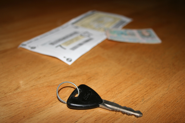
The composition could be improved here. Too much space between key and papers. Too much of table showing. |
|
|
|
07/21/2005 11:07:16 PM |
|
i'm not sure what that big piece of paper is, but i'll take a wild guess at registration. unfortunately it looses some of that independence feel when you think of licenses, registrations, and insurance being required. perhaps you could have found a cooler looking key chain, and perhaps replaced the distracting would grain background with a white or solid color. not that your idea wasn't sound, when i saw this shot i thought of another one where the parent is passing the car key to the teenager as he heads out the door on a date...not sure how hard that would have been to set up, if even a possibility, but perhaps a more exotic alternative. |
|
|
|
07/18/2005 07:16:54 PM |
|
hmmm...looks like a NY license |
|
|
|
07/17/2005 10:57:01 PM |
|
Meets the challenge, but, this photo lacks interest. |
|
|
|
07/17/2005 08:26:37 AM |
|
this is the best kind of transport! Nice idea |
|
|
|
07/17/2005 12:41:31 AM |
|
While a popular theme IMO no-one has presented this well. Composition lacks interest and lighting is flat. Good use of DOF |
|
Home -
Challenges -
Community -
League -
Photos -
Cameras -
Lenses -
Learn -
Help -
Terms of Use -
Privacy -
Top ^
DPChallenge, and website content and design, Copyright © 2001-2026 Challenging Technologies, LLC.
All digital photo copyrights belong to the photographers and may not be used without permission.
Current Server Time: 07/01/2026 12:31:41 AM EDT.