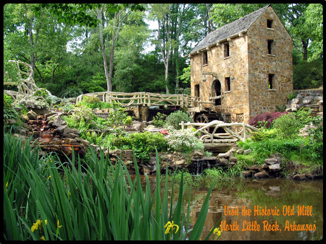
I love the composition you chose on this photo... the flowers in the lower left seem to create a nice lead into the scene. I also believe that the lighting for this shot worked out nicely... the exposure is good with no over/under areas... The only issue I see that bugs me a little in the composition is the top of the mill is a bit close to the edge of the frame... It looks like it could use just a little breathing room maybe...
The text was a tough situation on this card... there isn't really a great place to put it....
Hey Boyte! Lovely shot of the Old Mill here. I really expected it to do better. Once again, since I had no photo entered I didn't vote, but I do like the photo.
Beautiful. Love the angle with the mill over to the right. I also really like the railings of the bridge. The grass in the front is perfect. The focus seems a bit soft in places, I wonder if it was slightly windy? Otherwise great job. Just a suggestion, the writing is a little hard on the eyes. Maybe a non cursive print would have worked better. ~Heather~
What a verdant, lush place! I love your composition of this image. The color of your text is a little off to me, but maybe that's just my strange sense of color. I love this shot!
I like that you kept more of the creek to give yourself space to write the text, but the font and colour don't stand out enough from the water, and the tall leaves/grass distract from the quaintness of the mill.
This is a great historical attraction shot. But I'm afraid the text is almost lost; very hard to read for me. Maybe white or some lighter color, or put it on a larger border off of the pic.
The orange text feels out of place here for me. With that aside the photo itself looks really good I like it a lot. The colors are great, and the scene is very beautiful.






 Add photograph to your favorites
 Add photographer to your favorites

 Photographer found comment helpful.


