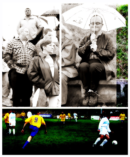
It's sad to see such a great image ending up so low in the ranking. Not only is it a great composition, but IMHO it perfectly reflects the atmosphere of an amateur football-match and it's spectators.
Your capture of emotion is excellent. Each frame stands well on its own, but coupled together with the others, makes for an excellent composition. I do however, feel that the lower frame is just a little to dark. Very nicely done.
I really enjoy the extremes in saturation and exposure here. It adds a feeling of artistic action. The three frames work well together, though the folks in the upper left frame seem to be looking, at first, at the guy with the umbrella. 9
I like the top 2 pictures ok. The bottom photo is just too dark and oversaturated. The dirt on the player is blue slightly. I'm rendering a guess as to who took this photo....
Love the top right photo. Excellent expression. I love high key images, however the top left seems a bit blown out. I love the bright over saturated colours in the bottom, but I'm not sure if it all ties in together. Good luck.
This is an interesting series, each in a different style (double edged sword - adds interest greatly, but the effects may overwhelm the photo/subjects). The all color frame seems dark and overly saturated. The all B&W frame is a bit overexposed, but has good contrast levels. The other frame is just adorable. This must have taken a lot of work to put together. 7 Rob the Swash
Over exposed and oversaturated. hehe... just stating what everyone else is saying, no doubt. I actually like the effect. But I think I would rather the top right photo be the one in color... that's where the real action is and the real life. The other two photos are typical. I'll revisit this photo later. It's so unique it deserves several visits. (8)
THe best image of the challenge, I would make it a winner! I think the under/over exposure are the perfect tools here, used masterfully. Congrats on an excellent, excellent image!
Damn this is so cool. This is truely artistic. You maybe should have desaturated the colored strip on the right-top pic a little more, and given a more \"paint brush\" effect to the bottom pic. Great work in any case.
JJ, I really like your composition of these three (colour stripe=four?) images. The story is told perfectly. What I don't like is the overexposed nature of the BW's, and the use of such high contrast and saturation in the soccer players. Still it all works very well. Good luck!






 Add photograph to your favorites
 Add photographer to your favorites


 Photographer found comment helpful.


