| Author | Thread |
|
|
05/07/2003 03:01:48 PM |
Hello from the Critique Club, Doug!
After all the discussion about the eroticism in this picture, I was amused to get it as my critique subject! I'm trying a new CC format for me, so let's hope its helpful!
Challenge requirements: Triptych
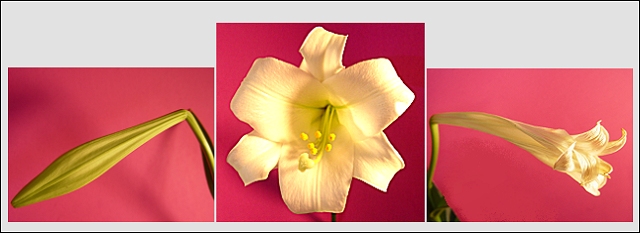
Its three pictures, put together to say something, here, the life of an easter lily, and I think you've achieved that beautifully.
Each shot is well placed in its frame, though I think I would have preferred more of an angle on the centre picture, I feel like I'm falling into the flower. I like how the first and third shot mirror each other.
I like the way your lighting picked up the shades in the first picture, but it blew out the highlights in the centre picture, which also seems a bit jagged along one edge, possibly due to your post processing. I'd also say the focus is a little soft, but I'm not sure I trust this monitor, so I won't push that point at all, besides, a little softness is nice, gives a warm feeling.
The uneven heights of the pictures are what detract from an otherwise fine entry. A lot of the comments below touched on the excess space above the side shots. I think I would have preferred a less tight crop on all three pictures to really bring out the contrast with the background and then presented them in equal sized frames. Also, that leaf in the right shot distracts just a tad from your symmetry.
As for the "eroticism" its pink, its open, the two side shots are mildly phallic.. but I'd say the subtle sexuality adds a sense of lushness to it all, and that's always appealing. :)
|
|
 Photographer found comment helpful. Photographer found comment helpful. |
Comments Made During the Challenge  |
|
|
05/04/2003 11:57:18 PM |
|
lots of sexual overtones, very maplethorpe |
|
| Photographer found comment helpful. |
|
|
05/02/2003 10:03:48 PM |
|
fantastic photos. my only complaint is on the combination of the photos re: alignment/borders - i think the overall effect would have been more powerful if you had not cropped the side photos smaller than the middle one, and if you had used consistent borders around all of the shots. |
|
| Photographer found comment helpful. |
|
|
05/02/2003 01:27:52 AM |
|
Very nice colors here. Each frame brings something new to behold, wtih the center frame getting, appropriately, most of the attention. Nice work. If it's to be improved, I would aim for a bit more mood through your lighting. Still high marks from me. Nice job. |
|
| Photographer found comment helpful. |
|
|
05/01/2003 03:37:47 PM |
|
Good idea for a series. The color and choice of backgrounds is very nice. Lighting is great for the first cell, but a bit too glaring for the center cell, in between for the last cell. Though the first and last cells are close to the same arrangement, the extra green in the last cell is a bit distracting. 7 Rob the Swash |
|
| Photographer found comment helpful. |
|
|
04/30/2003 07:14:29 PM |
|
This series seems compositionally unbalanced. I see how you were trying to achieve a rough symmetry here, but by doing so you lose the chronological theme that you present, as it is highly unnatural to look first at the left frame, then the right, and then the center. This is especially difficult to see as valuable because the result isn't truly symmetrical anyway, due to the partial blooming of the third frame. Also, the framing of this shot seems somewhat awkward, with the excess of white space above the shots. I do like the red background, which provides a good contrast for the flower. Individual these shots aren't enough to stand out as unique, and I admire the attempt at a unique presentation, but I don't think it worked out very well. 4 |
|
|
|
04/29/2003 07:57:42 AM |
|
My favorite of the flower triptychs this week - perfect choice of bg color and shading, wonderful soft lighting, technically excellent (to my eyes!) |
|
| Photographer found comment helpful. |
|
|
04/28/2003 01:03:10 PM |
|
The photos are lovely, but somehow that plain white background detracts from the overall grace of your images. |
|
| Photographer found comment helpful. |
|
|
04/28/2003 12:36:31 PM |
|
Pretty. I like the pink, but I'm not sure about the gray spaces at the top |
|
| Photographer found comment helpful. |
|
|
04/28/2003 11:33:00 AM |
|
Great idea and good colour and light. Choice of background colour just right. I would rather have the left and right images the same height as the central one. The white space behind just makes an odd and unappealing shape for me. |
|
| Photographer found comment helpful. |
|
|
04/28/2003 01:43:41 AM |
|
e.g. Botanical life-cycle of a lovely lilly. Laud your choice of background color. |
|
| Photographer found comment helpful. |
Home -
Challenges -
Community -
League -
Photos -
Cameras -
Lenses -
Learn -
Help -
Terms of Use -
Privacy -
Top ^
DPChallenge, and website content and design, Copyright © 2001-2026 Challenging Technologies, LLC.
All digital photo copyrights belong to the photographers and may not be used without permission.
Current Server Time: 07/02/2026 08:32:10 AM EDT.