| Author | Thread |
|
|
05/07/2003 01:06:34 PM |
Greetings from the CC!
First off great composition and shots!
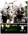
FOCUS and LIGHTING: The focus on the 2 small shots seems spot on... the big shot eye seems a tad soft but nothing dramatic. Maybe it's a n illusion caused by the darkness of the eye. :) Lighting is good. It works well here and is balanced among all 3 shots. I personaly would have likt a more direct light to brighten up the eye but that's just me.
COLOR: Skin tone is great and your white balance is good. Nothing worse than yellow eyes! :)
COMPOSITION: Having the eyes going in different directions add a dynamic feel to the image and the big eye looking strsight at you should brig forth many motions in people. The top eye seems farther away which is a bit distracting and the bottom eye is just a little anoyingly dark :)
Great shot! Keep it up!
Yanik |
|
 Photographer found comment helpful. Photographer found comment helpful. |
Comments Made During the Challenge  |
|
|
05/04/2003 08:53:50 PM |
|
In your main shot here, it looks like your focus might be locked onto the eyelashes or the area around the eye, instead of the eye itself, which isn't in sharp focus. Having messed around with many eye shots myself (and having submitted an eye series to this challenge) I know this is hard to avoid, but mostly you just have to experiment a lot to see what works. |
|
| Photographer found comment helpful. |
|
|
05/04/2003 05:28:33 PM |
|
excellent theme... good work with the macro shots also... :) |
|
| Photographer found comment helpful. |
|
|
05/04/2003 02:43:13 PM |
|
I don't usually score eyeball shots high, but this is an exception. The focus and clarity captured is well done. Your skin tones are soft and smooth. The top left eyeball may be looking a little to far to the left, but overall this is a nicely laid out triptych. |
|
| Photographer found comment helpful. |
|
|
05/04/2003 02:26:25 PM |
|
Fun image, nice layout, nice variety of images on the same, very limited, theme (didn't care for those submissions where one of the images was a repeat). Love the warm skin tones. Just the other day i saw a fun image by kkreeper and wonder whether this is him again? :) You've got your eye on me? Am tired of you staring at me, why don't you take a picture - lasts longer ;) 8 Journey |
|
| Photographer found comment helpful. |
|
|
05/02/2003 07:57:03 PM |
|
Interesting eye study. The lighting and exposure is really well done. One thing that I think is necessary in this kind of composition is to accurately align the frames. The two on the left are marginally higher than they should be, and the one in the bottom left corner is a little smaller than its counterpart. |
|
| Photographer found comment helpful. |
|
|
04/30/2003 11:17:52 PM |
|
I am so sorry... but I don't like this. It's too freaky! Unnatural. The lighting all so different too. What a trip to look at! hehe |
|
| Photographer found comment helpful. |
|
|
04/30/2003 06:53:05 AM |
|
Now this is a good idea! It turned out well too. Only the darkness on the left of the eye in the bottom-left pic is stopping this from getting a perfect score from me - 9. |
|
| Photographer found comment helpful. |
|
|
04/29/2003 06:38:21 AM |
|
You have a definite eye for photography |
|
| Photographer found comment helpful. |
|
|
04/28/2003 08:31:44 PM |
|
nice. eye shots can be harder than one thinks. only real comment - i think the sizing/alignment is a bit off between the photos. |
|
| Photographer found comment helpful. |
|
|
04/28/2003 12:37:09 PM |
|
Good use of this triptych form. Eyes are all different, and the larger image is right at me. Aagh! |
|
| Photographer found comment helpful. |
Home -
Challenges -
Community -
League -
Photos -
Cameras -
Lenses -
Learn -
Help -
Terms of Use -
Privacy -
Top ^
DPChallenge, and website content and design, Copyright © 2001-2026 Challenging Technologies, LLC.
All digital photo copyrights belong to the photographers and may not be used without permission.
Current Server Time: 07/02/2026 09:46:30 AM EDT.