| Author | Thread |
|
|
05/07/2003 02:49:55 PM |
Greetings from the Critique Club
By Inspzil
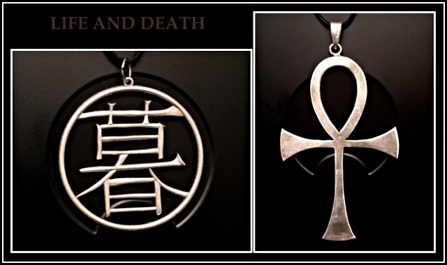
Composition - I really like the 2 charms on the necklaces. It's not a photo I would have even thought to do, but it really works. The little symbol on your computer case worked well as a common background for both. They both look like they are supposed to be there. That was a great idea. Good strong composition for both images, but especially together.
Technical - I like the greyscale idea. That makes them look classically old. The only thing is I wish they were sharpened one more time before you submitted. I do fear it a little though. You may have tried it and it didn't work well for you. The reason I fear it on the first one is because there is a little too much light on your background and that can really play hell with the sharpen feature in PS as it will bring all the little tiny white dots of light on the case and bring them to the forefront, making them look like a heavy coat of white dust on the background. Other than that, I think the exposure and framing and all that look good.
Overall - This is a nice image as is. But what I would've tried to do is put a little gleam of light or something on the "life" symbol to make it a little more symbolic and to catch the viewer's eye a little more. As it is, it's a bit flat. The ankh I might darken down a little for the symbolic thing, but it looks pretty good as is. I like this picture and I'm glad it made it in your top 4. Nice job and good luck - Bob |
|
 Photographer found comment helpful. Photographer found comment helpful. |
|
|
05/05/2003 04:20:29 PM |
Great pic Annida,
Good idea to use this background with the jewelery. Also like the idea of Death vs Life, the mix of cultures, the dark vs silver and the whole composition.
One improvement could be to take off the carrying rope off and perhaps even to grind the hanging eyes off the top.
It was one of my favs.
I'll take the Ankh if you don't mind. :)
|
|
| Photographer found comment helpful. |
Comments Made During the Challenge  |
|
|
05/04/2003 11:31:30 PM |
|
strange mixture of cultures, but a nice looking shot nevertheless |
|
| Photographer found comment helpful. |
|
|
05/02/2003 01:31:34 AM |
|
Really engaging and fascinating juxaposition here, and your bold and simple approach really works well. Not quite sharp on my monitor, but what great work! |
|
| Photographer found comment helpful. |
|
|
05/01/2003 11:40:57 PM |
|
This needs just a little tiny bit more focus to make it a really strong photo. I like the idea very much though. Nice job. |
|
| Photographer found comment helpful. |
|
|
04/30/2003 10:58:30 PM |
|
Good composition with the different size and aspect images. The metal is handled well - shiny, but not too shiny. Text coul dhave stood out more, IMO. |
|
| Photographer found comment helpful. |
|
|
04/30/2003 05:37:30 PM |
|
|
|
04/30/2003 12:02:01 PM |
|
i think using two equally sized photos would have been more powerful. the photos are well done, the life and death title seems too dark. |
|
| Photographer found comment helpful. |
|
|
04/28/2003 11:43:34 AM |
Hi Da!
Can't read the text - it's just too dark on my monitor - well, I can if I get REALLY close to the screen but that's not too practical. I like the two images but the layout doesn't work for me - it doesn't feel balanced or deliberately composed. |
|
| Photographer found comment helpful. |
|
|
04/28/2003 10:46:51 AM |
|
I really like this image quite a bit. I'm one who enjoys shapes and patterns and this image works well for me because of that. There are only two minor issues that I think could use some improvement in this composition.... 1 - the text at the top could stand to be just a tad brigher and 2 - the spacing between the two images should probably match the spacing on the outer edges of the frame so it doesn't look like they are just stuffed together. Presentation is everything in a composition like this :) Excellent shot, great idea and the black and white makes this one very strong.... great work :) - setzler |
|
| Photographer found comment helpful. |
Home -
Challenges -
Community -
League -
Photos -
Cameras -
Lenses -
Learn -
Help -
Terms of Use -
Privacy -
Top ^
DPChallenge, and website content and design, Copyright © 2001-2026 Challenging Technologies, LLC.
All digital photo copyrights belong to the photographers and may not be used without permission.
Current Server Time: 06/28/2026 11:21:32 PM EDT.