| Author | Thread |
Comments Made During the Challenge  |
|
|
05/03/2003 11:18:55 PM |
|
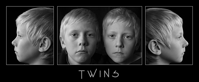
I just love your images, and the overall look of the triptych. I like the lighting that you chose, and really love the black and white, as well as the font that you chose to put on it. Overall very nice, definitely one of my top picks. |
|
 Photographer found comment helpful. Photographer found comment helpful. |
|
|
05/03/2003 12:59:13 PM |
|
Great one for the family's wall. I am more of the type who likes a bit more (contrasting) light on B&W. The same light casting of light on both of the twins faces in the middle pic would balance this out just a bit more. Nice focus. |
|
| Photographer found comment helpful. |
|
|
05/02/2003 06:26:30 PM |
|
Very nice! Great contrast, your lighting is nearly above reproach! (a slight bright spot on the left boy's left forehead) A true (non-score affecting) NIT - the left boy's lips are downturned....(I told you it was a NIT). 9 Rob the Swash |
|
| Photographer found comment helpful. |
|
|
05/02/2003 05:51:44 AM |
|
Good job Carsten or Mrs. Carsten. I like the way you took this. Black and white was a good choice for this serious type of mood. |
|
| Photographer found comment helpful. |
|
|
05/01/2003 07:18:55 PM |
|
Excellent shot. Love the symmetry of it all. Good job with the B&W since they are blond. Good job. Jacko. 8 |
|
| Photographer found comment helpful. |
|
|
05/01/2003 09:28:19 AM |
|
Great treatment, but they look like they'd rather be someplace else. |
|
|
|
04/30/2003 04:25:48 PM |
I think I've seen pictures of these kids before! Didn't they just get a camera? Anyway. Good pictures (are the kids always that serious?) Good composition. It looks to me that the space between picts 1 and 2 is a bit larger (1 or 2 pixels) than the space between 2 and 3? I like the choice of font, and the grey colour for the letters. I think the composition would benefit from moving the word up just a little bit (2-5 pixels). Hard to say. Good work!
Added - later one - looking at it again, I can't make up my mind if the space between the left and middle pictures is or not equal to the space between the middle and right. It's been bothering me. |
|
| Photographer found comment helpful. |
|
|
04/30/2003 03:30:41 PM |
|
This is so cute... although who would have known if you actually have twins or just one boy ;-) I really like this... your in my top 12! -9- |
|
| Photographer found comment helpful. |
|
|
04/30/2003 03:18:22 PM |
|
well done! good subject and framing. 9 |
|
| Photographer found comment helpful. |
|
|
04/30/2003 10:10:29 AM |
|
| Photographer found comment helpful. |
|
|
04/30/2003 06:51:11 AM |
|
Haven't I seen this boy somewhere before? You have a great imagination and you've pulled off your idea very well, I like this very much. Your lighting set up is perfect which is something I have a lot of problems with when I try such shots. |
|
| Photographer found comment helpful. |
|
|
04/29/2003 02:23:59 PM |
|
Excellent black and white work. Nice use of the multi image theme as well. One of my favorites this week. 10 |
|
| Photographer found comment helpful. |
|
|
04/29/2003 06:36:05 AM |
|
Have we seen these young men before, let me think? They must be a very patient pair. Nice work.8 Morgan |
|
| Photographer found comment helpful. |
|
|
04/29/2003 12:21:54 AM |
|
Interesting study showing the similarity but individuality. Each photo is well done and could stand alone. |
|
| Photographer found comment helpful. |
|
|
04/29/2003 12:03:29 AM |
|
Wow, it's kind of eery looking. Great shots and interesting lighting. |
|
| Photographer found comment helpful. |
|
|
04/28/2003 09:02:39 PM |
Wonderful... portrait work. The boys are really growing up fast.
Carstan? |
|
| Photographer found comment helpful. |
|
|
04/28/2003 08:41:47 PM |
|
|
|
04/28/2003 07:51:50 PM |
|
We know that boy now ;-) and I think he has a very 'photogenic' face (not sure of the word in english). I like this one a lot with its dyssymetries within the symmetry. 8 |
|
| Photographer found comment helpful. |
|
|
04/28/2003 04:45:20 PM |
|
I don't like the text to much, but the photographical part of the image is perfect! |
|
| Photographer found comment helpful. |
|
|
04/28/2003 12:36:08 PM |
|
I love this set.... i think the subdued lighting and the expressionless children seem to set an intriguing mood in this image. The composition here really rocks :) I think you should definitely print and frame this shot... these boys will treasure this when they are older.... kudos :) - 10 - setzler |
|
| Photographer found comment helpful. |
|
|
04/28/2003 12:20:07 PM |
|
Extremely cool image. Creative idea, technically well done b/w work, good lighting, and I like the 'traditional' tryptich layout. 10 |
|
| Photographer found comment helpful. |
|
|
04/28/2003 11:19:11 AM |
|
|
|
04/28/2003 10:30:05 AM |
|
Perfect! Great tones and layout. 10 -danny |
|
| Photographer found comment helpful. |
|
|
04/28/2003 06:27:13 AM |
|
Creative composition. Good Job |
|
| Photographer found comment helpful. |
Home -
Challenges -
Community -
League -
Photos -
Cameras -
Lenses -
Learn -
Help -
Terms of Use -
Privacy -
Top ^
DPChallenge, and website content and design, Copyright © 2001-2026 Challenging Technologies, LLC.
All digital photo copyrights belong to the photographers and may not be used without permission.
Current Server Time: 06/27/2026 05:28:33 PM EDT.