| Author | Thread |
Comments Made During the Challenge  |
|
|
06/19/2005 06:11:45 PM |
Love this shot
10
good luck
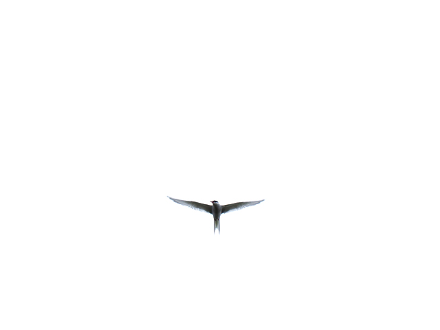
the empty space just makes this a great image to look at |
|
|
|
06/17/2005 05:43:25 PM |
|
really very nice and simple! |
|
|
|
06/17/2005 10:42:01 AM |
|
Way too far away. Other than the wings, I have nothing else to tell me what it is. Too much white as well. |
|
|
|
06/17/2005 08:29:29 AM |
|
Too much sky and not enough bird. My thoughts. |
|
|
|
06/16/2005 12:44:40 PM |
|
Nice shot. Too much white space and not enough bird detail for me |
|
|
|
06/15/2005 05:14:11 PM |
|
|
|
06/15/2005 05:03:01 PM |
|
great use of negative space. |
|
|
|
06/15/2005 05:21:11 AM |
|
simple but aesthetically pleasing 10 |
|
|
|
06/14/2005 11:49:33 PM |
|
wow, i love the simplicity, and how you still managed to keep the bird's details when it's flying over such an overcast/bright sky. |
|
|
|
06/14/2005 05:55:06 PM |
|
|
|
06/14/2005 01:19:13 PM |
|
very simple and beautiful.i'm loving it. |
|
|
|
06/14/2005 12:24:34 PM |
|
so simple yet so beautiful |
|
|
|
06/13/2005 02:38:05 PM |
|
|
|
06/13/2005 12:06:20 PM |
|
|
|
06/13/2005 09:26:31 AM |
|
I like the use of negative space, but would have preferred to see the bird better. I like the position the bird is in with it's wings spread. |
|
 Photographer found comment helpful. Photographer found comment helpful. |
|
|
06/13/2005 04:43:17 AM |
|
This is very effective but I still want to zoom in. . . . |
|
| Photographer found comment helpful. |
|
|
06/13/2005 12:06:22 AM |
|
There's too much negative space here. If the background weren't blown out I'd find this image more interesting. It looks like the crop is slightly off center, which I find distracting. |
|
| Photographer found comment helpful. |
Home -
Challenges -
Community -
League -
Photos -
Cameras -
Lenses -
Learn -
Help -
Terms of Use -
Privacy -
Top ^
DPChallenge, and website content and design, Copyright © 2001-2026 Challenging Technologies, LLC.
All digital photo copyrights belong to the photographers and may not be used without permission.
Current Server Time: 06/30/2026 11:41:13 PM EDT.