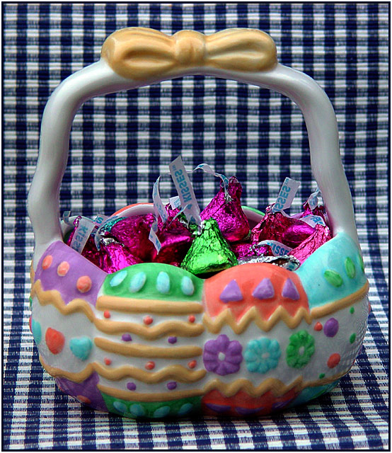
This still life composition is nice... Compositionally, there are a few things that I would have explored to see the results... I may have rotated the basked a little to allow the handle to create a stronger sense of three dimension and depth in the image.
A little more depth of field may have makde an improvement here as well. The front edge of the basket seems just a tiny bit soft.
I'm a little concerned about the background material in this shot. I, personally, think it adds too much contrast to the image and makes it a bit busy overall.
I don't like the background. I think its too busy for this basket which is pretty busy itself in a cute way. I think a lot of the reason I don't like the background is because at the top of the basket it doesn't look like it really should be there. It looks kind of fake in other words.
might have cropped out the bottom of the photo where you can see the dish towel edge curving off the table. odd choice of background, and i think the limited DOF hurt you here as the basket is a little out of focus, looking a little too plastic (maybe it is) with both the front focus looking soft and the handle vs. the background clashing a little. cropping in on just the candies might have helped, as the labels come out very crisp.






 Add photograph to your favorites
 Add photographer to your favorites


 Photographer found comment helpful.


