First off I would like to say that I found this photo to be average and gave it a 5.
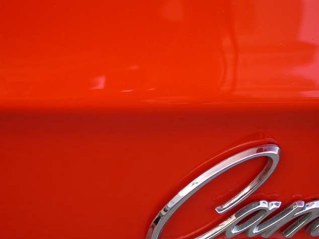
RESPECTS THE THEME: Your color choice is red and meets the challenge without a doubt.
FOCUS AND COLOR: your focus is good and the color, with its various tones, is pleasing to the eye.
IMAGE QUALITY & COMPOSITION: Image quality seems poor due to jpeg compression. I can see this mostly around the silver lettering. The composition is what seems less pleasing to the eye. I don't mind not seeing the complete name of the car but I do find that the crop is too tight and cutting out part of the C is distracting since the word is already cut to the right. The choice of adding silver lettering the the photo is a good idea though. Having the dark red line not completely centered is also somewhat distracting IMO. Moving it up to the top 3rd would bring mroe impact to the shot.
funny thing about words in a photograph is that people like to read them in their entirety. This, of course, put your image in a sticky situation because of logo issues.
The subject is the red, which stands out, and is done fairly well. The focus on it is a bit off..
Although the subject is the red, the inclusion of the contrasting chrome is a good idea to give it relativity. I feel it is a bit too cropped off however, especially at the bottom.
woah.. You know , you get a 150K to work with, you sucked the quality out of your photo to yeil a 16k photo. Don't be afraid to use up the 150. Aside from the low low jog quality, good photo.





 Add photograph to your favorites
 Add photographer to your favorites

 Photographer found comment helpful.


