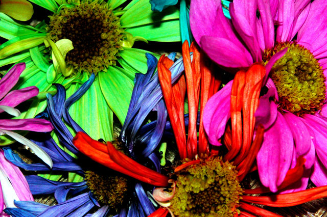
Colorful indeed! I like the abstract feel to this shot, and the colors are certainly strong. Nice work. The flower centers (I lack the correct term) does seem to lack aesthetic appeal though, their drab colors contrasting sharply with the impressive petals, and I think that hurts the image a little. Good luck. 7
Beautiful colors, and lots of movement - one of my faves so far. The metal showing through in the lower right corner is a bit distracting though. Cropping out the bottom 1/3 would improve it IMO
Cool colors here but I wish they weren’t in such bad shape. How did you get them to be all those different colors? The focus looks a little soft and the lighting looks very harsh. I think the composition is nice but the focus and lighting take a lot away to a potentially strong picture. You might be able to soften up the light by making a diffuser out of tissue paper and holding it in front of the light source. You could also possibly place the flowers in the shade and use a white piece of poster-board to reflect the light onto the flowers to make things softer. I gave it a 3 but I think with a little more work it could be a lot better.







 Add photograph to your favorites
 Add photographer to your favorites


 Photographer found comment helpful.


