| Author | Thread |
|
|
04/14/2003 11:34:31 PM |
Critique Club
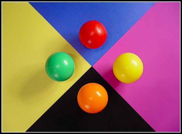
Positives - Good use of color on this photo... you definitely fit the challenge, and made it eye appealing and interesting, yet plain and simple. Contrary to normal rules of photography this photo works quite well the way it is centered... and I like the fact you didn't make it square as that would have made it too simple and the extra width makes you take a second to look more closely at the photo. The color combos you used are interesting and not what you would expect to see, which adds to the photo as a piece of art and personal rather than just a photo of 4 balls on opposite colors or whatever. Very nice job on focusing, nice and clear... and good job spacing looks pretty equal to me!
The not so positives - as mentioned in some of your comments I would have tried to make the light a little less harsh, and tried to not have the shadows that you have. I like the seems on the balls, but to be nitpicky the yellow seam is not pointing directly towards the center and is slightly crooked... this makes it look as though (though you prolly didn't) you just plopped them down haphazardly... this is a little detail that people at DPC will count down for whether we like it or not. The one other thing I see is that (without taking a ruler to it) the yellow side looks slightly larger than the purple side.
Otherwise nice job. Good use of color, nice and bright with a simple pattern that is eyepleasing and not very distracting. Interesting photo. Good luck in the future!
-Talya |
|
Comments Made During the Challenge  |
|
|
04/13/2003 11:21:44 PM |
|
I like the use of colors, and the simplicity of the photo. The light looks a tiny bit off center, but its really a problem. Must have been hard making sure the balls did not roll off lol |
|
 Photographer found comment helpful. Photographer found comment helpful. |
|
|
04/13/2003 08:27:16 PM |
|
I think I'd like a square crop here -- but I might decide I like the "unexpected" better after seeing both...good job overall |
|
| Photographer found comment helpful. |
|
|
04/12/2003 09:43:37 PM |
|
Good Idea. Simple and to the point |
|
| Photographer found comment helpful. |
|
|
04/12/2003 08:56:05 PM |
|
|
|
04/12/2003 02:20:15 PM |
|
Nicely set up -- good balance. |
|
|
|
04/11/2003 03:28:18 AM |
|
nice structure. perhaps the shaddows could have been more even, or less obvious on the yellow background - they distract a bit from the overall 'structure'. |
|
| Photographer found comment helpful. |
|
|
04/10/2003 11:16:24 PM |
|
Very nice - can't think of a single thing I would change. Definately meets challenge, great concept, nice border choice and nice focus! Very high score! :) |
|
| Photographer found comment helpful. |
|
|
04/09/2003 06:36:17 PM |
|
|
|
04/09/2003 11:41:14 AM |
|
|
|
04/09/2003 08:24:30 AM |
|
Very abstract and very successful, good job - 8. |
|
|
|
04/08/2003 11:34:09 PM |
|
Interesting shot. I think the shadows (particularly on the green ball) distract from the photo overall. Still a good score from me, though. |
|
|
|
04/08/2003 10:39:04 PM |
|
great idea... attention to detail, the seams on the balls should either be hidden or facing the same way |
|
|
|
04/08/2003 10:31:54 PM |
|
A simple, graphic composition very well done. Great shot! |
|
| Photographer found comment helpful. |
|
|
04/08/2003 06:29:48 PM |
|
|
|
04/08/2003 04:35:37 PM |
|
My favorite this week - very pleasing! |
|
| Photographer found comment helpful. |
|
|
04/08/2003 03:07:06 PM |
|
Interesting! I like it because it's definitely different! |
|
| Photographer found comment helpful. |
|
|
04/08/2003 02:04:28 PM |
|
Excellent setup. I like all the complements except if yellow complements green, how does yellow complement purple? (I would have liked it better if red was on blue, blue was on red, yellow was on green, green was on yellow -like that) |
|
|
|
04/08/2003 01:02:21 PM |
|
|
|
04/08/2003 02:32:26 AM |
|
Nice crisp lines. The seams of the balls distract. More interesting Highlights might be someting to try. |
|
| Photographer found comment helpful. |
|
|
04/08/2003 01:16:50 AM |
|
Nice idea, just to be picky, I think the image would look a little better without the shadows, but I like the shot as a whole, nice job |
|
| Photographer found comment helpful. |
|
|
04/07/2003 06:44:30 PM |
|
This would have been great for the Symmetry challenge, but is great here also. |
|
|
|
04/07/2003 05:09:56 PM |
|
Such a simple idea and brought together beautifully. Top 3 for me! Outstanding compostion and focus. |
|
| Photographer found comment helpful. |
|
|
04/07/2003 02:17:21 PM |
|
|
|
04/07/2003 01:25:03 PM |
|
Too bad for the lines on the balls. |
|
|
|
04/07/2003 10:36:49 AM |
|
very nice and bright. Good job |
|
|
|
04/07/2003 10:14:52 AM |
|
|
|
04/07/2003 10:08:14 AM |
|
good color but need to bounce the light so the glare isnt so bad and maybe seems not showing |
|
| Photographer found comment helpful. |
|
|
04/07/2003 03:57:31 AM |
|
NIce display. Good luck. 8. |
|
| Photographer found comment helpful. |
Home -
Challenges -
Community -
League -
Photos -
Cameras -
Lenses -
Learn -
Help -
Terms of Use -
Privacy -
Top ^
DPChallenge, and website content and design, Copyright © 2001-2026 Challenging Technologies, LLC.
All digital photo copyrights belong to the photographers and may not be used without permission.
Current Server Time: 06/27/2026 06:16:50 PM EDT.