| Author | Thread |
|
|
05/04/2005 04:31:01 PM |
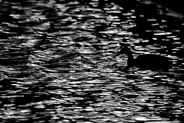
I checked the histogram for your picture and there are a substantial number of pixels evenly distributed between black and white although there are a goodly number of pure white and an equally goodly number of pure black pixels. If I increase my monitor brightness hardly at all, the deep black silhouette of the duck starts to lighten.
I believe you and other people all have your monitors set correctly. You just have a greater tolerance for high contrast photos with less aggregate light than dark areas.
I personally try to get my money's worth out of having a camera that can shoot over 6 megapixels of high resolution raw images to leave so many pixels completely black or white.
If the duck had been in a less dark area so the silhouette would have stood out better, you might have had fewer complaints. |
|
 Photographer found comment helpful. Photographer found comment helpful. |
|
|
05/04/2005 03:10:03 PM |
|
sorry to report that i think it is your monitor that needs calibrating... |
|
Comments Made During the Challenge  |
|
|
05/02/2005 04:31:13 AM |
|
| Photographer found comment helpful. |
|
|
05/01/2005 05:57:22 PM |
|
the duck is hidden too much |
|
| Photographer found comment helpful. |
|
|
05/01/2005 05:16:49 PM |
|
i feel this is too dark and youve lost a lot of detail in the image. |
|
| Photographer found comment helpful. |
|
|
04/30/2005 11:51:26 PM |
|
Beautiful black and white. Great lighting |
|
| Photographer found comment helpful. |
|
|
04/30/2005 09:36:47 PM |
|
Very cool how the duck's silhouette blends in with the water |
|
| Photographer found comment helpful. |
|
|
04/30/2005 08:33:25 PM |
|
excellent idea, and maybe just a little too dark... |
|
| Photographer found comment helpful. |
|
|
04/30/2005 08:04:49 PM |
|
nice shot, if the water was more placid it would be more minimalistic. |
|
| Photographer found comment helpful. |
|
|
04/30/2005 04:57:29 PM |
|
incredible shot, the high contrast really works. |
|
| Photographer found comment helpful. |
|
|
04/30/2005 05:38:12 AM |
|
Nice silhouette of the duck. I also like the texture of the water. 8 |
|
| Photographer found comment helpful. |
|
|
04/30/2005 01:35:19 AM |
|
Great composition with the silhouette of the water fowl in sharp contrast to the very interesting waves. Sharp, detailed, clean processing. Overall this is fabulous! 9 |
|
| Photographer found comment helpful. |
|
|
04/29/2005 11:18:17 PM |
|
If the sillohette of the duck stood out more and the water less, this would have been a stronger capture. |
|
| Photographer found comment helpful. |
|
|
04/29/2005 11:08:22 PM |
|
This is almost opposite the intent of the challenge...attention is drawn everywhere but the main subject. Otherwise interesting lighting on the water. |
|
| Photographer found comment helpful. |
|
|
04/29/2005 08:50:53 PM |
|
The bird is too centered on the height imo, it should be placed with the rule of thirds in mind. |
|
| Photographer found comment helpful. |
|
|
04/29/2005 06:23:12 PM |
|
| Photographer found comment helpful. |
|
|
04/29/2005 05:42:52 AM |
|
For composition purposes I (IMHO) would have put the bird on one of the thirds. 5 |
|
| Photographer found comment helpful. |
|
|
04/29/2005 03:17:19 AM |
|
| Photographer found comment helpful. |
|
|
04/28/2005 10:00:09 PM |
|
Nice use of silhoette. Wish the entire background was water. The top right corner is drawing the eye too much. |
|
| Photographer found comment helpful. |
|
|
04/28/2005 07:27:12 PM |
|
This would do a lot better if were not dark. |
|
| Photographer found comment helpful. |
|
|
04/28/2005 07:13:00 PM |
|
i like the idea behind this photo and although the even tone throughout makes it minimal i feel the subject is lost |
|
| Photographer found comment helpful. |
|
|
04/28/2005 01:59:00 PM |
|
your color is too dark. nice pix thought |
|
| Photographer found comment helpful. |
|
|
04/28/2005 12:33:35 PM |
|
Too dark to be a "striking" photo. |
|
| Photographer found comment helpful. |
|
|
04/28/2005 11:13:51 AM |
|
I think this meets the challenge but the waves make it seem real "busy" to me JMO good job. |
|
| Photographer found comment helpful. |
|
|
04/28/2005 10:34:12 AM |
|
I'm sorry I can't hardly see the object. Nice idea though. |
|
| Photographer found comment helpful. |
|
|
04/28/2005 09:37:55 AM |
|
This is a nice image. i really like the darks and lights seen in this picture.. the contrast looks great. Nice work. |
|
| Photographer found comment helpful. |
|
|
04/28/2005 07:45:23 AM |
|
Real artistic done. Good B&W. |
|
| Photographer found comment helpful. |
|
|
04/27/2005 10:06:00 PM |
|
I find the subject not dominant enough to grab my attention. |
|
| Photographer found comment helpful. |
|
|
04/27/2005 05:56:53 PM |
|
Good idea, but a little hard to find the duck. |
|
| Photographer found comment helpful. |
|
|
04/27/2005 05:28:52 PM |
|
good idea but the bird is too close to the dark water in the top right of the picture, |
|
| Photographer found comment helpful. |
|
|
04/27/2005 11:32:56 AM |
|
dark, mysterious, I like it - 7 |
|
| Photographer found comment helpful. |
|
|
04/27/2005 10:16:55 AM |
|
| Photographer found comment helpful. |
|
|
04/27/2005 07:47:45 AM |
|
interesting concept... but i don't think the duck is the strongest point IMO as it gets lost in the water. but overall, pleasing image. 7 |
|
| Photographer found comment helpful. |
Home -
Challenges -
Community -
League -
Photos -
Cameras -
Lenses -
Learn -
Help -
Terms of Use -
Privacy -
Top ^
DPChallenge, and website content and design, Copyright © 2001-2026 Challenging Technologies, LLC.
All digital photo copyrights belong to the photographers and may not be used without permission.
Current Server Time: 06/28/2026 03:29:50 PM EDT.