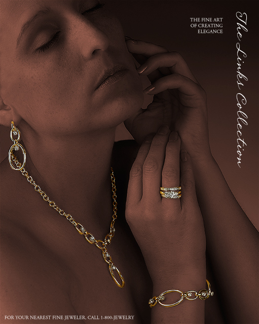
It's been a while since I submitted to a challenge... I've been busy with "real life" stuff. But I really wanted to submit something for this challenge. Of course I waited to the last minute (I'm a huge procrastinator)... late Sunday night, after getting back from a family birthday party, I asked my wife to "model" for me. This shot was taken at 10:46pm and the final revision submitted at 11:57pm... 3 minutes to spare!
I had a feeling there would be a lot of close-up macro shots, something I had previously attempted (but did not succeed) with jewelry in the Basic Editing Advertisement Revisited challenge, so I wanted to try something different. This was inspired by a real ad that I remember seeing a while back (or at least this is what my brain remembers of it.) Of course the problem with this approach is the 640px maximum size: intricate details of the ad's focal point (i.e. the individual facets of the diamonds) are lost. Oh well. Submitting anyway...
Statistics
Place: 7 out of 159 Avg (all users): 6.8577 Avg (commenters): 7.9444 Avg (participants): 6.7100 Avg (non-participants): 6.9589 Views since voting: 3475 Views during voting: 456 Votes: 246 Comments: 60 Favorites: 2 (view)
Hey Eddie: Outstanding use of techinque to bring forth this elegant lovely study. Great advertising because the image kept rising in my third eye. It is those images that one desires to show another person, like look, is this not grand?
I'm torn here....At one point I like the way she's all dark, but at another I don't like it. I just can't make up my mind. However, I love the way it augments the brighter jewelry.
Good job bringing out the jewelry, and the type works too -- though I usually make it a little bolder if it's reversed type for use in a print ad, as that can sometimes plug up on the press and become less-readable.
great color treatment - the jewelry really stands out. the typography is good too, though perhaps just a wee bit small, and I think the text in the upper right ("The fine art . . .") should have been vertically aligned with the script at the edge. (7)
The focus on the jewelry is very nice. I don't know that I care for the "tonality"? of the rest of the photo. The pinkish glow and cropping distracted me. My first thought on seeing this photo was "The model looks bald" It should have been "What great jewelry" I'm giving this a "6" The jewelry does stand out, has good lighting and focus.
Very nice shot, I give it high marks. Personally I think with the excellent toning that you did to background/secondary subject here that the shot may have had even more impact with maybe just the ring or the ring and the necklace. Great shot, excellent post processing but for me just feels like too much bling bling to look at. Still one of my tops. Fonts are fine, still undecided about the vertical text.
Very good and very professional. Colours, angle, text, everything. Only thing I'd suggest is to make the woman and background a little darker so the jewelry sticks out more.
Cool concept! I really like the shades of the skin vs the jewels. They seem to be missing some sharpness unfortunatly. Text is cool and looks good, not in the way too much. I seem to think you selected the jewels out of the pic for better editing... 6
It may be this monitor cause I'm at work, but her skin tone looks really really odd. I'm sure you darkened her in post to bring out the jewelry and make it pop, but something more needs to be done with her skin and i can't put my finger on it. I love the picture as a whole. Nice model, idea, and composition. Right on with the fouc too. Nice work!
Well done, like how the jewelry really pops off of the body. Good work at toning out the person and making her drop to the background. However the jewelry could use a big more pop and brightness.
Nice job duplicating the feel of a Jewelry Advertisement. Good pop with the jewelry pieces...they stand out nicely. Nice use of lighting to get this effect. I'm thinking this will make top 10. Good luck.
Very good use of post precessing to make the jewelry stand out of the model. Text is not too intrusive also, very good. My only quirk is personal, but your model seems to be in pain, likes she don't enjoy wearing the jewels (an impression not good in a jewel ad). A very gentle smile would have make this picture top rated. 6
Could definitely see this in a magazine or jeweller`s window.
The lighting and colour tone is perfect for contrasting with the gold.
The very professional look this image has should guarantee a good placing....best of luck.
One of the better photo's I have seen so far. I like how you brought out just the jewery. I like the expression on the model. I do not care for the font however to me that does not count.
This is the type of layout I look for! Creative and refined. The pieces really stand out as does the font! I only would recommend a larger font Up top and that the photo be from a different angle to avoid the overlapping earring and necklace. The bottom text is what we refer to as "a call to action" and is not in many of the entries. Outstanding work.
VERY nicely done!
Perhaps the best in this challenge and can't find a single thing to suggest here.
All the marks of a professional advertisement! (10)
Fantastic composition. I like the low-key subject. I think your approach here is top notch, but perhaps the jewelry could have been brightened up more to be more prominent. 7
Wow ! Excellent ! I love it ..... I love the contast between the darkness of the model and the shine of the jewelry. Superb. I just think the jewelry is a bit too shiny though; it looks just a little bit oversharpened, but it's probably caused by resizing .... Good luck !
complete package! like your positioning of the text and the font you used , interesting lighting that draws attention to the jewelry, one of my ribbon picks this challenge BOL
Okay - text here makes this look like a good advertising image. Image is very high class. Great lighting and use of dodge/burn type effect to focus on jewellery (spelled wrongly ;) ).
I, personally have found that most pics in this challenge that have used models have been lacking...IMHO...this however, is NOT!!! This is gorgeous...the jewelry stands out and is the center of attention....a real eye catcher!!!! 10
You should've quit with the text at the top. The bottom text is overkill and detracts from the image. Otherwise an excellent job. Great way to make the jewelry stand out.





 Add photograph to your favorites
 Add photographer to your favorites

 Photographer found comment helpful.


