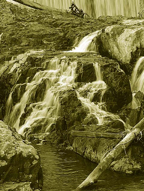
Nice work, LeonJr! I think it has great flow. I'd use black & white, though, the sepia isn't my cup of tea for this shot. I'd like to see the unedited version of it, looks like a great place to take photos.
Hey Leon. Looks like you did a good job capturing the photo. Not sure what time you took the photo, but if you wait until later in the day or use a polarizer or neutral density filter, you will be able to use a longer exposure without overexposing. By exposing this longer, you'll get even more of a blur effect in the waterfall.
I have to agree with the comments below, the color treatment you used really hurt this shot. I better color treatment probably would have put you in the mid 5's.
this looks like a place that has potential, but, honestly, your treatment kinda wrecks it for me. those colors are anything but inviting. good luck with everyone else.
Interesting use of duotone, but seems unnatural to me. Not quite sure if there is more of a waterfall on top, or just a cliff face, but I think this shot may have improved if you included more of it.
The sepia here is very strong, and I feel it injures the image. In pure b/w, your nice point of view would contrast the water with the darker rocks, giving depth and tone to the photo. Here, the sepia is so strong it kind of evens things out a bit, thus undermining the nice contrasts you initally captured.
Nice possibilities on this photo, however I'm distracted no only by the log on the right hands side of the frame but also but the extreme sepia tone in the over all photograph. I would have like it a little toned down. Still good attempt!






 Add photograph to your favorites
 Add photographer to your favorites

 Photographer found comment helpful.


