| Author | Thread |
|
|
04/13/2003 02:32:42 AM |
Greetings from the Critique Club!
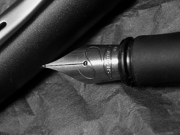
I left some comments below already, and I certainly concur with all of the positive comments on this photo! This image carries with it a mild mystique that invites me to not only study it, but to take my thoughts beyond perhaps to other things such as nostalgia, history, and the pleasures of good workmanship. It is more than a scientific study; it is an invitation to join with you in admiring this instrument and symbolically others like it.
Your lighting goes far in helping this concept. It is not the lighting of science, but instead the angles from the upper left provide depth and nice, rich, dark shadows. Your point of view is helpful here, too, since by showing us the shadows, you are showing us a more complete instrument that has depth and "life." Which is why your natural inclination to provide that negative space on the bottom works so well and is so appropriate to this image: this negative space allows us to think that there is more here than meets the eye. It both balances the image visually and also hints to us that there is more out there.
You've captured some interesting textures here, too, and these add to the feeling of soft complexity (with its accompanying awe) the image creates.
Some below have mentioned the overexposed line through the word Sheaffer, and while this light does go far in adding depth and in bringing focus to the word--elements I see as crucial to your photo--It may be that making it just a bit softer wouldn't be as distracting. The pen itself could use some focus on the right, too; I can't see the purpose in softening the focus there when all else is so sharp. In other words, by itself, it does not establish a pattern to which the rest of the image conforms.
In sum: this is a marvelous image of which you should be proud. It accomlishes what it sets out to accomplish with flying colors (well, black and white anyway!). Only a few very minor things distract me, and they don't distract me enough to not think that this photo is superb. I gave you a 9 during the challenge, and I stand by it! Perhaps someday I'll be able to come up with a photo this intricate and refined. It is something I aspire to.
Keep up the good work! I hope to see more of your work in the future.
-David |
|
 Photographer found comment helpful. Photographer found comment helpful. |
Comments Made During the Challenge  |
|
|
04/06/2003 10:28:35 PM |
|
You give this simple instrument a sense of wonder wtih the perspective and tones. I love the contrasting textures. |
|
| Photographer found comment helpful. |
|
|
04/06/2003 12:16:47 AM |
|
Good tones and composition. I wish the lighting wereless harsh across the name on the nib. |
|
| Photographer found comment helpful. |
|
|
04/04/2003 08:01:30 AM |
|
Simple, but effective. This is very nice. Your composition is strong and the wrinkled cloth makes an effective backdrop. -danny |
|
| Photographer found comment helpful. |
|
|
04/02/2003 07:58:34 PM |
|
| Photographer found comment helpful. |
|
|
04/01/2003 11:57:44 AM |
|
Nice Black and White! They've been around forever, haven't they? Nice focus on the nib. Actually nice overall focus on the whole picture. Nice shot really. Good lighting, nice dof. |
|
| Photographer found comment helpful. |
|
|
03/31/2003 04:11:47 PM |
|
I love fountian pens. This is a pretty good shot but the background distracts from the pen. |
|
| Photographer found comment helpful. |
|
|
03/31/2003 11:12:37 AM |
|
|
|
03/31/2003 09:29:46 AM |
|
Pretty, but over exposed on the men itself, and too much digital noise in the pen split and on the edges of curves. (6) |
|
| Photographer found comment helpful. |
|
|
03/31/2003 03:18:17 AM |
|
Nice crispness/tones. Too much empty space below the nib and the line of the pen cap is confused with the edge of the nib. But good nevertheless. |
|
| Photographer found comment helpful. |
|
|
03/31/2003 01:10:11 AM |
|
real good, only the stripe of light's right across the name, which shoould maybe be crystal sharp if it's gonna be the name of the photo. seven though, it is real pretty. |
|
| Photographer found comment helpful. |
Home -
Challenges -
Community -
League -
Photos -
Cameras -
Lenses -
Learn -
Help -
Terms of Use -
Privacy -
Top ^
DPChallenge, and website content and design, Copyright © 2001-2026 Challenging Technologies, LLC.
All digital photo copyrights belong to the photographers and may not be used without permission.
Current Server Time: 06/28/2026 06:26:42 PM EDT.