| Author | Thread |
Comments Made During the Challenge  |
|
|
03/26/2005 07:34:27 PM |
|
nice tones and POV, but i'd crop out at least a half of the black space under the desk. make it long. |
|
|
|
03/26/2005 12:27:14 PM |
|
Kinda boring shot....lol....7 |
|
|
|
03/25/2005 07:06:59 PM |
|
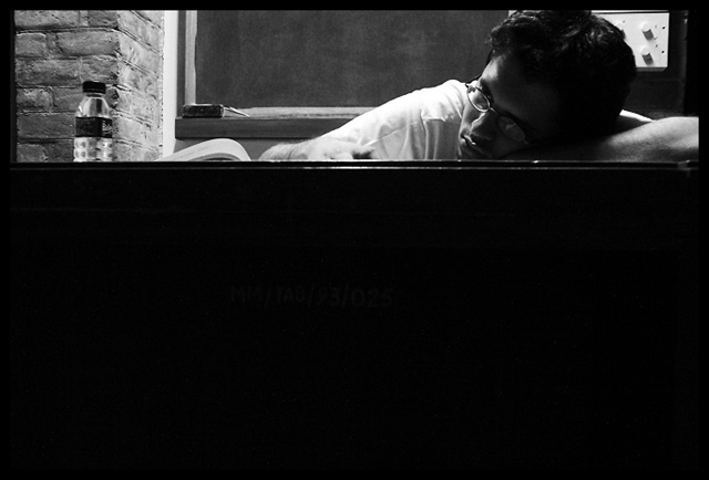
Very interesting perspective. He definately does look bored. The only thing is I think his head is cropped too closely, which is a little distracting. I would have left at least a little space above his head. But great contrast and composition! |
|
|
|
03/24/2005 09:54:54 PM |
Be sure to turn the calendar feature off. I don't think this picture would have been too bad even if you'd cropped right above the date. As is, it's got a bit too much black for my tastes.
Good luck. |
|
|
|
03/23/2005 07:40:14 PM |
|
Nice use of the rule of thirds. |
|
|
|
03/23/2005 01:55:21 PM |
|
I feel the cropping is a little too harsh on this shot as ther is too much desk darkness... Leaving about a half head height above the gents head would have made this feel more balanced but the B&W really suits the image. |
|
|
|
03/23/2005 11:50:48 AM |
|
I would have liked to see it cropped long and thin. I don't like the negative space here, but I still like it |
|
|
|
03/23/2005 09:15:04 AM |
|
|
|
03/23/2005 08:21:26 AM |
Could have cropped out most of the bottom black. other than that, very good shot. 7.
L8r, |
|
|
|
03/23/2005 05:49:15 AM |
|
Home -
Challenges -
Community -
League -
Photos -
Cameras -
Lenses -
Learn -
Help -
Terms of Use -
Privacy -
Top ^
DPChallenge, and website content and design, Copyright © 2001-2026 Challenging Technologies, LLC.
All digital photo copyrights belong to the photographers and may not be used without permission.
Current Server Time: 06/28/2026 08:59:00 AM EDT.