| Author | Thread |
Comments Made During the Challenge  |
|
|
03/04/2005 11:23:20 PM |
|
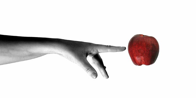
One of the best billboards in the bunch. The first part of your Title is unnecessary, and that background finger is a little distracting to me, but the simplicity of your visual message is fantastic. 8 |
|
 Photographer found comment helpful. Photographer found comment helpful. |
|
|
03/04/2005 10:15:55 PM |
|
| Photographer found comment helpful. |
|
|
03/04/2005 08:34:40 PM |
|
doesn't come across like a fruit stand advert to me, but i still like it. seems almost techie to me. great pic though, love the desat. |
|
| Photographer found comment helpful. |
|
|
03/04/2005 06:11:45 PM |
like this shot a lot,
Could see this on a billboard
Good luck |
|
| Photographer found comment helpful. |
|
|
03/03/2005 03:17:58 PM |
|
Clean and simple. Maybe a bit too much so. I keep expecting some kind of shadow ore support for the apple. But then, I guess the magic would be gone... |
|
| Photographer found comment helpful. |
|
|
02/28/2005 10:05:15 PM |
ok, i am voting this challenge in 2 passes. in this pass, you will get a partial comment and a score. then i will come back to comment again. if you have any problem whatsoever with this comment, pm me and let me know. otherwise, take it with a grain of salt...i'm not trying to be a know-it-all, i'm just explaining where i'm coming from in voting this challenge. and, if this comment is NOT helpful (of if you think i'm full of $#!+), don't mark it helpful.
billboards are a science unto themselves. a lot of research has gone into determining just how much information a person can digest and retain in specific time spans. they use this information to develop formulas for determining the number of words and letters to use on billboards, as well as their sizes. they also determine the size and number of visual elements to include.
the graphics/photograph on a billboard are designed to get the point across in a moment. on the road, a driver will have less time with a billboard than a voter will give your image. this is a key element in the challenge: composing a shot that will get its point across quickly and succintly. along those lines, a strong composition will probably have few details and make strong use of negative space.
--------------
you nailed it! excellent work. at 90 mph, i'd know i'd have about 45 seconds to slow down. i really hope to see this on the front page! |
|
| Photographer found comment helpful. |
|
|
02/28/2005 05:22:51 PM |
|
Great - but better with a stem (and maybe a leaf) on the apple. Otherwise - great job. |
|
| Photographer found comment helpful. |
|
|
02/28/2005 04:11:48 PM |
|
WOW... this is a great shot. |
|
| Photographer found comment helpful. |
|
|
02/28/2005 11:19:06 AM |
|
Great shot! Very well done. Way to make a fruit stand sign look cutting edge. 9 |
|
| Photographer found comment helpful. |
|
|
02/28/2005 07:14:33 AM |
|
Not a huge fan of selective desat, but this work! |
|
| Photographer found comment helpful. |
|
|
02/28/2005 04:30:39 AM |
|
Its a nice one... just apple feels bit flat...maybe bit more light would do. |
|
| Photographer found comment helpful. |
|
|
02/28/2005 02:12:43 AM |
|
Well composed, got my attention - 9 |
|
| Photographer found comment helpful. |
|
|
02/28/2005 01:53:09 AM |
|
Simply AWESOME. Nice lighting, composure, everything A+. 10! |
|
| Photographer found comment helpful. |
|
|
02/28/2005 12:15:09 AM |
|
It's a great shot but perhaps a little too high tech for a fruit stand? More like IBM or Mac material. |
|
| Photographer found comment helpful. |
Home -
Challenges -
Community -
League -
Photos -
Cameras -
Lenses -
Learn -
Help -
Terms of Use -
Privacy -
Top ^
DPChallenge, and website content and design, Copyright © 2001-2026 Challenging Technologies, LLC.
All digital photo copyrights belong to the photographers and may not be used without permission.
Current Server Time: 07/01/2026 12:54:32 AM EDT.