| Author | Thread |
|
|
08/26/2005 12:21:03 AM |
|
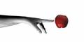
Haha! That's freaking awesome! Looks just like the billboards! |
|
 Photographer found comment helpful. Photographer found comment helpful. |
|
|
03/05/2005 08:00:16 AM |
|
Great job. Easily matches the quality of actual Apple billboards I've seen. |
|
| Photographer found comment helpful. |
Comments Made During the Challenge  |
|
|
03/04/2005 10:44:22 PM |
|
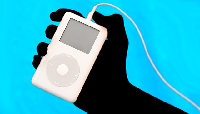
Ya, good work. The background color works well, the hand effect is cool. The ipod might be a liltte blown, needs a little more detail in the dial. ....10 |
|
| Photographer found comment helpful. |
|
|
03/04/2005 10:13:39 PM |
|
| Photographer found comment helpful. |
|
|
03/04/2005 09:47:23 PM |
|
Good idea, nice composition I like the graphic like appearance. I wish the iPod would be turned on. 8 |
|
| Photographer found comment helpful. |
|
|
03/04/2005 08:36:33 PM |
|
Looks like their ads! Well done for the challenge. |
|
| Photographer found comment helpful. |
|
|
03/03/2005 03:20:12 AM |
|
Composition: 7, Technical: 8, Appeal: 7, Challenge: 8, Overall Calculated Average Score: 8 |
|
| Photographer found comment helpful. |
|
|
03/02/2005 05:39:48 PM |
My evaluation method of this challenge is as follows:
1. Did you catch my eye while I was driving by? Yes.
2. If I didn't catch the text while I was driving, did you intrigue me enough to look for this billboard again? Yes.
3. Did you sell your stuff to me? I think so.
4. Extra thoughts: I've seen this before. A bit corny but sells well. (7)
|
|
| Photographer found comment helpful. |
|
|
03/01/2005 06:10:40 PM |
Well composed, but thisis just not original enough for me. Two points I should mention:
1. the iPod should be on
2. you've gone too far with the silhouette - the real Apple ads have some subtle visible form and aren't completely black
That said, it's probably been a useful exercise for you and it's still pretty. What a touch of genius campaign that is though eh? |
|
| Photographer found comment helpful. |
|
|
03/01/2005 02:47:00 PM |
Good job! Very effective.. Is the hand covered by a glove?
|
|
| Photographer found comment helpful. |
|
|
03/01/2005 09:26:35 AM |
ok, i am voting this challenge in 2 passes. in this pass, you will get a partial comment and a score. then i will come back to comment again. if you have any problem whatsoever with this comment, pm me and let me know. otherwise, take it with a grain of salt...i'm not trying to be a know-it-all, i'm just explaining where i'm coming from in voting this challenge. and, if this comment is NOT helpful (of if you think i'm full of $#!+), don't mark it helpful.
billboards are a science unto themselves. a lot of research has gone into determining just how much information a person can digest and retain in specific time spans. they use this information to develop formulas for determining the number of words and letters to use on billboards, as well as their sizes. they also determine the size and number of visual elements to include.
the graphics/photograph on a billboard are designed to get the point across in a moment. on the road, a driver will have less time with a billboard than a voter will give your image. this is a key element in the challenge: composing a shot that will get its point across quickly and succintly. along those lines, a strong composition will probably have few details and make strong use of negative space.
---------------------
graphically speaking, you ABSOLUTELY NAILED this one! now, in terms of the billboard challenge, you should really get smacked for failing to meet the RECOMMENDED size. it's obvious you know your way around here--how could you let such an anal-inducsive detail to slip by...surely you know better than to leave something that critical up to the whims of the masses! i really hope they will look past their urge to check your image properties and only vote on what they see...good luck! |
|
| Photographer found comment helpful. |
|
|
03/01/2005 05:33:52 AM |
|
| Photographer found comment helpful. |
|
|
03/01/2005 04:45:34 AM |
|
Nice use of colors and composition. |
|
| Photographer found comment helpful. |
|
|
02/28/2005 10:35:28 PM |
|
Looks very much like all the real ipod ads. The edges need to be sharper though. |
|
| Photographer found comment helpful. |
|
|
02/28/2005 09:09:02 PM |
|
The lack of an image on the iPod's display detracts from the image. Aside from that your edges are softer than the format calls for. |
|
| Photographer found comment helpful. |
|
|
02/28/2005 06:59:55 PM |
|
Love this photo. Simple, concise and great contrast. You can see it for miles, and it really catches your eye! |
|
| Photographer found comment helpful. |
|
|
02/28/2005 04:50:05 PM |
|
This is so cool! I wonder how you got your whole hand black... and legally edited too! You must be some kind of super-genius! |
|
| Photographer found comment helpful. |
|
|
02/28/2005 01:49:41 PM |
|
damnation....this is really good, but i feel like its not original |
|
| Photographer found comment helpful. |
|
|
02/28/2005 01:37:32 PM |
|
|
|
02/28/2005 11:17:36 AM |
|
Yep, that's an IPod ad if I ever seen one. 10 |
|
| Photographer found comment helpful. |
|
|
02/28/2005 12:58:35 AM |
|
My biggest complaint is that the dimentions are not 640X320 like everyone elses. Also wish the sharpness of the chord was a bit better. Now that I got all that negativity out...this is a great imitation of one of their ads! Nice job. Very pleasant composition. :)) |
|
| Photographer found comment helpful. |
|
|
02/28/2005 12:37:21 AM |
|
oh wow - looks exactly like the commerctials - awesome photo |
|
| Photographer found comment helpful. |
|
|
02/28/2005 12:28:52 AM |
|
Looks like the real thing! Only complaint is the small halo around the cord |
|
| Photographer found comment helpful. |
Home -
Challenges -
Community -
League -
Photos -
Cameras -
Lenses -
Learn -
Help -
Terms of Use -
Privacy -
Top ^
DPChallenge, and website content and design, Copyright © 2001-2026 Challenging Technologies, LLC.
All digital photo copyrights belong to the photographers and may not be used without permission.
Current Server Time: 06/29/2026 12:25:02 PM EDT.