| Author | Thread |
Comments Made During the Challenge  |
|
|
02/22/2005 06:36:45 PM |
|
|
|
02/22/2005 04:41:28 PM |
|
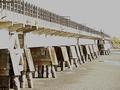
Picture way to small and to dark to judge. In the future try using the 640X option. I believe you may have a good photograph here, it meets the challenge from what I can see [not much] and the title. I had to view the title to even have an idea of what the picture was. Good luck and wish you well in the challenge. |
|
|
|
02/22/2005 10:39:57 AM |
|
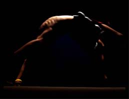
I think this is a really cool picture and I want to vote it higher, but it's so dark I can't really see what's going on. Let me know if that's an intentional effect. |
|
|
|
02/22/2005 09:37:39 AM |
|
Looks like an interesting & creative shot, but you've posted such a small image, it's really hard to see the details. |
|
|
|
02/22/2005 05:46:53 AM |
|
lighting - a little too dim |
|
|
|
02/21/2005 02:59:52 AM |
|
Great idea. Too dark. And I have a bright LCD monitor. I'm sure for some it'll be even darker. |
|
|
|
02/20/2005 09:24:52 PM |
|
Too small and dark to really judge the quality of the photo. I can see a beam and ribs, but everything else is too dark. |
|
|
|
02/19/2005 07:39:04 PM |
|
I like this shot but I wish it were a little larger. Its hard to see the details. |
|
|
|
02/19/2005 04:00:44 PM |
|
Could be good but small size hides details. |
|
|
|
02/19/2005 11:22:39 AM |
|
Picture is too small. Please see the sizing recommendations for the site. |
|
|
|
02/19/2005 09:32:24 AM |
|
THe picture is to dark to see what the photo should be |
|
|
|
02/18/2005 06:22:48 PM |
|
Nice form and composition but much too dark. 5 |
|
|
|
02/18/2005 04:01:53 PM |
|
sorry, too dark and small... |
|
|
|
02/18/2005 03:34:56 PM |
|
If it's my monitor I apologise, but this just looks too dark to pick out enough detail. Also too small, sorry. |
|
|
|
02/18/2005 01:43:58 PM |
|
Good idea but a little small and dark. |
|
|
|
02/18/2005 06:03:03 AM |
|
What a shame you didnt make this bigger and brighter it could have scored well for thought 'outside the box' - good luck |
|
|
|
02/17/2005 11:34:41 PM |
|
nice photo if it were lighter |
|
|
|
02/17/2005 08:50:21 PM |
|
|
|
02/17/2005 08:29:17 PM |
|
This is a little too dark and a little too small to make out. |
|
|
|
02/17/2005 07:06:17 PM |
|
potentially could be a great shot, if it was just a bit brighter and quite a bit larger :) |
|
|
|
02/17/2005 05:34:50 PM |
|
too dark I can't see it and too small. try using the size allow for challenge mine help |
|
|
|
02/17/2005 01:24:33 PM |
|
I'm going to say what I would bet that most other commenters say: too small. I can see what it is, but only just. I understand that this is intentionally a low-key shot, but being presented in such a small size, I feel that its impact is lost. Like the concept, though. |
|
|
|
02/17/2005 04:11:25 AM |
|
brilliant idea, might need to work on simplifying the shot, difficult now to realise really what is on the picture |
|
|
|
02/16/2005 11:53:46 PM |
|
great idea but the picture is too small to really see much detail |
|
|
|
02/16/2005 10:04:27 PM |
|
too dark to really make out the subject. |
|
|
|
02/16/2005 09:15:56 PM |
|
|
|
02/16/2005 02:36:34 PM |
|
Interesting take on the challenge. Too bad that it is so small. Also the lighting is problematic. I wish I could give it more than 3. Good try though. |
|
|
|
02/16/2005 01:44:25 PM |
|
At this magnification, it's just a little too hard to see. |
|
|
|
02/16/2005 11:29:37 AM |
Should have been bigger.
Very good picture.
Good light.
A 10 from bigger picture.
|
|
|
|
02/16/2005 10:13:01 AM |
|
so small and dark, hard to see. I think it's a good idea, it's just hard to judge at this size |
|
|
|
02/16/2005 07:17:58 AM |
|
its a REAL shame its so dark & a bit too small, i reckon you could score a lot higher |
|
|
|
02/16/2005 06:34:31 AM |
|
not lit enough for me and on the small side |
|
|
|
02/16/2005 05:14:10 AM |
|
Great interpretation of the challenge, but just too dark to see any of the detail. |
|
|
|
02/16/2005 02:45:39 AM |
|
Too dark. Too small. Highlighted area seems over-exposed. |
|
Home -
Challenges -
Community -
League -
Photos -
Cameras -
Lenses -
Learn -
Help -
Terms of Use -
Privacy -
Top ^
DPChallenge, and website content and design, Copyright © 2001-2026 Challenging Technologies, LLC.
All digital photo copyrights belong to the photographers and may not be used without permission.
Current Server Time: 06/29/2026 07:40:30 AM EDT.