| Author | Thread |
Comments Made During the Challenge  |
|
|
02/15/2005 11:35:05 PM |
|
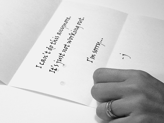
Tack on sharp focus, great details in the hand/ring/letters. The tears are a great extra touch. Nice job |
|
 Photographer found comment helpful. Photographer found comment helpful. |
|
|
02/15/2005 04:55:18 AM |
|
really liked this picture |
|
| Photographer found comment helpful. |
|
|
02/14/2005 05:11:01 AM |
|
I can't tell you how many times I've heard that before!.. that, and "it's not you, it's me!" |
|
| Photographer found comment helpful. |
|
|
02/13/2005 06:02:54 PM |
|
The three drops on the page look like they were placed there as opposed to falling teardrops. |
|
| Photographer found comment helpful. |
|
|
02/10/2005 03:53:35 PM |
|
A litlle stif maybe...Handwritten would of given a better effect. The drops look like the are on waxed paper! |
|
| Photographer found comment helpful. |
|
|
02/10/2005 03:39:50 PM |
|
the background needs to contrast more with the paper of the letter. |
|
| Photographer found comment helpful. |
|
|
02/09/2005 03:41:53 PM |
|
depressing .. very plain yet full of pain...... i like it |
|
| Photographer found comment helpful. |
|
|
02/09/2005 08:24:48 AM |
|
Very emotive, and also very sharp photo! |
|
| Photographer found comment helpful. |
|
|
02/09/2005 07:11:42 AM |
|
You should at least have written the letter by hand, and chosen a paper that looks less like it came just out of a printer. Your idea is good, but I don't like the perspective that much. What about taking the shot from behind her, using head and shoulder to frame the letter? 6. |
|
| Photographer found comment helpful. |
|
|
02/09/2005 01:27:15 AM |
|
I thought of do a sucide as well, Love the way this turned out. Maybe something else that completes the story? Answers why. |
|
| Photographer found comment helpful. |
|
|
02/09/2005 01:26:47 AM |
|
Beautiful font for such a sad note..... |
|
| Photographer found comment helpful. |
Home -
Challenges -
Community -
League -
Photos -
Cameras -
Lenses -
Learn -
Help -
Terms of Use -
Privacy -
Top ^
DPChallenge, and website content and design, Copyright © 2001-2026 Challenging Technologies, LLC.
All digital photo copyrights belong to the photographers and may not be used without permission.
Current Server Time: 06/28/2026 07:59:33 PM EDT.