| Author | Thread |
Comments Made During the Challenge  |
|
|
02/08/2005 09:34:33 PM |
|
|
|
02/08/2005 06:10:33 PM |
|
Why the small size? So har to judge whey you can't see it. |
|
|
|
02/08/2005 03:24:53 PM |
Great shot, but why so small?
Good luck |
|
|
|
02/08/2005 11:39:11 AM |
would be better if the picture was larger
|
|
|
|
02/07/2005 11:51:10 PM |
|
think this would have done well if it were re-sized |
|
|
|
02/07/2005 01:32:04 PM |
|
Lovely but way way way too small. 7 |
|
|
|
02/07/2005 03:21:46 AM |
|
it´s very good but very small |
|
|
|
02/06/2005 10:23:19 PM |
|
|
|
02/06/2005 07:43:03 AM |
|
Too bad it's too small, cause I really like the pic. |
|
|
|
02/06/2005 05:59:33 AM |
|
i like the shot but i think you could upload a bigger image.gave it a 6 |
|
|
|
02/05/2005 07:48:05 PM |
|
Although you really need to use the largest format possible in presenting your challenge entries (640 largest side), I can see this shot has great potential and give it a 7. |
|
|
|
02/05/2005 02:47:34 PM |
|
I'm sure you'll get a dozen other comments like mine, but I have to say, IT'S TOO SMALL!! It looks like it *might* be a nice picture, but I can't really tell... |
|
|
|
02/05/2005 02:42:14 PM |
|
This looks great... but it is just too small to really appreciate. Nice perspective. |
|
|
|
02/05/2005 12:31:37 PM |
|
I think it´s a good image, but the problem is that it´s too small. |
|
|
|
02/05/2005 11:50:59 AM |
|
would be nice if it were bigger |
|
|
|
02/05/2005 06:39:14 AM |
|
Much too small to judge. Needs to be sized properly. |
|
|
|
02/05/2005 05:48:12 AM |
|
I'm sure that this is a great shot, but it's just too small. From what I can see, the converging lines really give a sense of perspective, but as I say, too small. |
|
|
|
02/04/2005 10:34:46 PM |
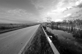
Looks like could be a ok shot, sky might be blown......just can't tell....to small.
resize around 600 t 640 on the long side....It help a ton... |
|
|
|
02/04/2005 05:44:04 PM |
|
Too bad, this would have looked great in 640 pixels... |
|
|
|
02/04/2005 02:46:33 PM |
|
|
|
02/04/2005 01:42:39 PM |
|
I like the lines. Maybe the horizon should have been higher up. To bad the photo is so small. |
|
|
|
02/04/2005 12:28:03 AM |
|
very nice shot. black and white makes it stand out. personally i would have shot the sign a little closer |
|
|
|
02/03/2005 08:45:30 PM |
|
looks beautiful nice B&w reduction and beautfully framed, but just to small to be judges fairly. Did you post this at high DPI. Bigger is better. |
|
|
|
02/03/2005 08:16:55 PM |
|
very nice capture, to bad it is so small. |
|
|
|
02/03/2005 02:54:06 PM |
|
closer shot on signs would be nice. |
|
|
|
02/03/2005 02:45:25 PM |
|
|
|
02/03/2005 12:04:55 PM |
|
Great photo, shame it`s so small. |
|
|
|
02/03/2005 11:19:53 AM |
|
A nice picture, but it's much, much too small. Even with a 1MP camera you should get larger pictures...Well, the guiding lines save you: 7. |
|
|
|
02/03/2005 10:56:26 AM |
|
Nice pic. If only it was larger! |
|
|
|
02/03/2005 10:49:44 AM |
|
way too small to appriciate |
|
|
|
02/03/2005 10:30:04 AM |
|
Nice picture, nice geometry involved but it's too small. A full 640 pixels in lenght would really add value to this picture. |
|
|
|
02/03/2005 10:10:45 AM |
|
This looks like a good photo, but it's too small. It's hard to make out any of the details. |
|
|
|
02/03/2005 09:34:35 AM |
|
Interesting image but way too small....you've probably had everyone saying that... |
|
|
|
02/02/2005 11:03:31 PM |
|
Nice Shot. You should make it a little larger since then it would be easier to see. I really like it though!! :) |
|
|
|
02/02/2005 10:58:36 PM |
|
|
|
02/02/2005 10:01:02 PM |
|
Very pretty photo. Its a little hard to see it this small though. |
|
|
|
02/02/2005 07:53:35 PM |
|
This would be a nice picture if only it were not so small. |
|
|
|
02/02/2005 05:33:16 PM |
|
Probably a nice shot but so small. Make sure you resize to the maximum dimensions allowed (640 pixels on the longest side) so we can see it and judge it fairly. |
|
|
|
02/02/2005 03:08:47 PM |
|
Eventhough it's not much bigger than a thumbnail, I still find this much more intriguing than most I've seen so far.(7) |
|
|
|
02/02/2005 01:46:19 PM |
|
I like how you shot this with a short focal length as opposed to a long one, it really helps accentuate the distance of the road. Personally, I would have moved in closer to the sign, as this would accentuate the distance even more, but I still think its a good picture. |
|
|
|
02/02/2005 12:17:37 PM |
|
I very much like the composition but I wish this photo was larger. |
|
|
|
02/02/2005 11:58:02 AM |
|
Nice tones and good perspective and nice clouds. Should be full sized. |
|
|
|
02/02/2005 09:48:20 AM |
|
This is a neat picture...but I cant see it very well due to the size. I would love to see this larger. |
|
|
|
02/02/2005 09:36:19 AM |
|
|
|
02/02/2005 09:22:15 AM |
Love the black and white.
You may want to check out the sizing requirements for the site. Small pictures never do well in the challenges. Message me if you need help.5 |
|
|
|
02/02/2005 08:18:43 AM |
|
You can submit a larger photo - I think that would help show this one off better. Interesting sky and nice contrast. |
|
|
|
02/02/2005 08:10:26 AM |
|
I really like this one, but its such a shame its so small. I've given you 6. 9 if it were bigger. |
|
|
|
02/02/2005 08:00:32 AM |
|
Man I wish this picture was a little bit bigger. I would of really liked to give you a couple points higher, but I cant see the image. I was having trouble getting my image to 640 pixels wide and being under 150kb, if you are having the same trouble contact me I can help. |
|
|
|
02/02/2005 07:03:46 AM |
|
I so wish this were bigger. I think it could have scored really well, but it's too small to see properly at this size. |
|
|
|
02/02/2005 07:03:30 AM |
|
Shame it's too little because the photo is great |
|
|
|
02/02/2005 04:07:09 AM |
|
Lovely shot, but needs to be bigger. I hope this doesn't lose you marks in the challenge |
|
|
|
02/02/2005 01:57:41 AM |
|
AHHH. Why did you submit such a small version. Looks like a great photo but you should always use the 640 max cap of your longest size. Darn! |
|
Home -
Challenges -
Community -
League -
Photos -
Cameras -
Lenses -
Learn -
Help -
Terms of Use -
Privacy -
Top ^
DPChallenge, and website content and design, Copyright © 2001-2026 Challenging Technologies, LLC.
All digital photo copyrights belong to the photographers and may not be used without permission.
Current Server Time: 06/30/2026 11:56:19 PM EDT.