| Author | Thread |
|
|
03/23/2003 11:07:44 PM |
Greetings from the Critique Club };-)
Initial thoughts
A real stretch for the challenge, not your best work technically.
Composition/ Content
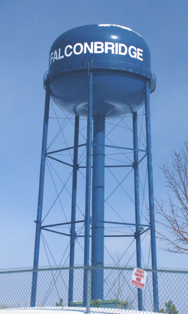
OK, you took a chance with the name. I'm sure you got a few laughs and didn't really care about the score so it worked. I felt it was a bit of a stretch for the challenge as apparently did the voters. The tower seems to be leaning to the right but not enough to validate the title. If you had more of an angle, it might have worked a bit better.
Technical
Focus seems a little soft and seems like it could use some sharpening. The whole shot feels unbalanced. I think I would have cropped it above the fence so that the legs of the tower would lead you to the Name on the tower. As it is, the name seems lost in the shot. It seems a little washed out as well, perhaps and little more contrast and some saturation in post processing may have helped here.
My Opinion On The Photo
I think you were probably just having some fun and it works that way. I think you could have improved it technically and still had a much better score. There are great technical shots that are way off the challenge that score pretty well. Keep on shooting!!
I would be happy to talk further about this shot if you would like to contact me.
DougPaz
|
|
 Photographer found comment helpful. Photographer found comment helpful. |
Comments Made During the Challenge  |
|
|
03/16/2003 02:21:50 PM |
|
Falconbridge, Ontario? Interesting take on the theme. Would be nice if more contrast between the water tower and the sky - perhaps at sunset or sunrise. |
|
| Photographer found comment helpful. |
|
|
03/15/2003 12:24:16 AM |
|
It's a bridge, and a clever idea. The image is kind of lackluster for me. Have you experimented with composition, cropping and framing? |
|
| Photographer found comment helpful. |
|
|
03/14/2003 08:13:05 PM |
|
| Photographer found comment helpful. |
|
|
03/13/2003 04:56:33 PM |
|
nice shot of the tower, but I think you should have given us the whole thing, moved back a bit. . . |
|
| Photographer found comment helpful. |
|
|
03/12/2003 05:24:17 PM |
|
| Photographer found comment helpful. |
|
|
03/12/2003 02:26:14 PM |
|
I like the contrast of blues. |
|
| Photographer found comment helpful. |
|
|
03/11/2003 09:22:59 PM |
|
sorry, but this picture has nothing to do with the challenge...there is supposed to be a bridge in the picture, not the word |
|
|
|
03/11/2003 09:22:10 PM |
|
Fun interpretation - as the photo contains the word 'bridge.' |
|
| Photographer found comment helpful. |
|
|
03/11/2003 02:17:32 PM |
|
Yeah. . .not a very good idea. This doesnt meet the requirements of the challenge and doesn't make for a very good image either. |
|
|
|
03/11/2003 10:58:30 AM |
|
this is definitely a unique interpretation of the 'bridge' theme... - setzler |
|
|
|
03/10/2003 09:37:33 PM |
|
Sorry - The rhyme doesn\t work for me, neither does the association. Good idea, but.... |
|
|
|
03/10/2003 07:22:02 PM |
|
Pretty good picture, but your challenge aspect is a stretch for me. Usually I don't like background/subject pics that are the same color, but in this case, I think it does work (just enough contrast). The fence and sign - nope. Same for the tree branches appearing from nowhere. 5 Swash |
|
|
|
03/10/2003 05:50:21 PM |
|
A bit of the stretch for the challenge... |
|
|
|
03/10/2003 05:46:01 PM |
Howdy! This shot, although has a humorous element, is missing some key technical qualities. The tower itself is leaning to the right (maybe why you titled it this). This makes the eye feel the shot is unbalanced. The positioning of the tower in the middle of the frame puts all the focus on it, however, with so much of the legs from the tower showing your eye isn't drawn to the text at the top. Instead you get lost in the fence and tree. The tree also makes for noise that isn't needed. If you had cropped just above the tree and used maybe a square framing as a result the eye would clearly see the text on the tower and the viewer would relate this to the challenge better. The blue in the tower is nice, it however is flat against the sky behind it. Upping your contrast a little might help seperate the two elements. The edges around the tower are a little soft, maybe a light sharpen to help make it more crisp.
This is a funny idea, I just feel it got lost in your translation to the viewers.
(my two cents) |
|
| Photographer found comment helpful. |
|
|
03/10/2003 02:40:35 PM |
|
|
|
03/10/2003 11:34:03 AM |
|
|
|
03/10/2003 01:15:33 AM |
|
Not as much as Wannapitae! |
|
Home -
Challenges -
Community -
League -
Photos -
Cameras -
Lenses -
Learn -
Help -
Terms of Use -
Privacy -
Top ^
DPChallenge, and website content and design, Copyright © 2001-2026 Challenging Technologies, LLC.
All digital photo copyrights belong to the photographers and may not be used without permission.
Current Server Time: 06/28/2026 03:30:54 PM EDT.