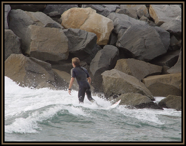
Great perspective between surfer & the rocks. A little burning in of the water, or bringing the brightness down, contrast up a bit would help the richness here. Not a big fan of the border, but took nothing away because of it. ((7))
The lighting looks pretty flat in this photo, I know there is not a lot you can do about that. We kind of lose the surfer against the rocks. Again I know you did not have control of this but I think this would be a whole lot better if he was facing us.
Interesting rocks, but there is nothing drawing me into this photo. Perhaps having him just about to exit the frame would have made the title stronger?
ay-carumba! i hope you're getting some good comments and suggestions, and that you're not getting overlooked in this monster challenge. a couple suggestions i would offer would be to go easy on the borders; this one is a bit heavy and distracting. also, your image would probably be stronger if your subject wasn't so centered. and lastly, you could use just a bit more contrast to make your subject stand out from the rocks. good luck!
Loving the color of the rocks and the motion of the water. I would like to have seen the guy a little farther to the right with more of a view of where he was hoping to go, rather than him being so centered. 7
Altho its not my preference in taste of pictures it is still very nice. I find the choice of borders on this pic to be ugly? or distracing to say the least. The picture has fairly good clarity but lacks vibrantness. The title goes well with the photo.







 Add photograph to your favorites
 Add photographer to your favorites


 Photographer found comment helpful.


