This critique comes courtesy of the Critique Club :)
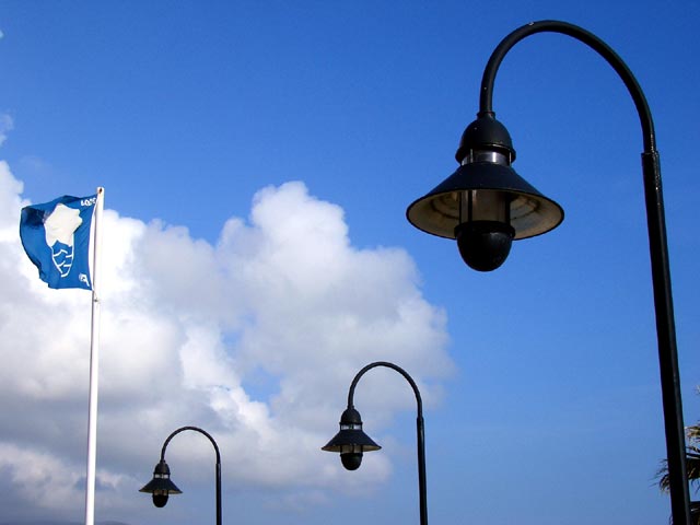
Like everyone has mentioned, without knowing the challenge, it becomes hard to discern that the flag is intended to be the main subject. If this wasn't your main concern, it could certainly be considered a more solid picture.
Two things that pose some room for improvement are basically a possible change in position or perspective. The palm tree in the bottom-right corner of the image does not show enough to gain much in photographic interest, but does distract the viewer's eye slightly. The flag, especially considering its colors, would possibly do well either fully in front of the clouds or fully in front of the sky - I'm not sure that I like the line of clouds cutting through it just towards the top of it.
I'm guessing that your camera does not allow you to zoom in far enough to fully isolate the flag, so you have done well with what you had to work with. The foreground lamp certainly provides a three dimensional appeal, but perhaps detracts from the idea of "wind". You have good color balance - perhaps a slight increase in exposure or brightness if you were hoping to render more detail in the foreground object. In another challenge, this may have done better, but DPCers are always looking for a solid connection to the challenge.
Hope this helps, let me know if you have any questions. |