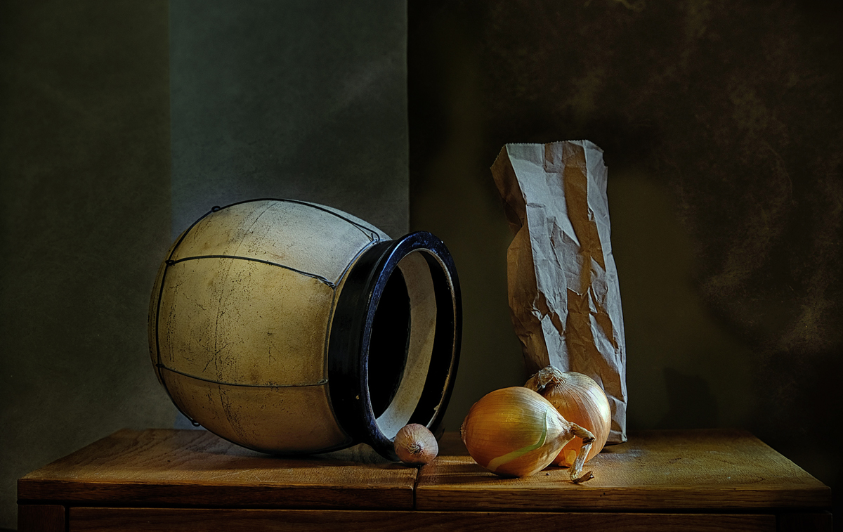
I am disappointed by the suggestions/criticisms made here. They are not, as they pretend to be, small ones: each change, were change possible, would alter the dynamic of the whole composition, and of all the compositions this is indeed the most dynamic.
I am immensely reassured that Mariuca is sticking to her guns.
I probably appreciate your work more now after looking at it again. I loved the colors, textures and the light but two things stopped me from really liking it - the sharp vertical line in the center plus the front onion's position and strong lighting. The vase, the table and the paper bag were perfect :)
PS I am not a trained artist so what do I know, I might be completely wrong.
Thank you Margaret for your opinion. I don't think that you have to be a trained artist to have an opinion but a person with a taste for the arts and some exposure to it. Moreover, trained artists are stubbornly immersed in their way of thinking or doing things!
The abc's of photography such as rule of thirds or symmetry etc bore me although for beginners are useful like drawing from gypsum statues in the first years of art schooling. I think that I am missing so much of the technical aspect in photography which makes me very shy when I read what some of you are playing with.
I understand your point of view - I quite liked the sharp line dead center - that's how I started the composition. I understand Marry Ann's comment on de-centering the composition. I stick to my gun though.
For really interesting reading or videos google Matisse/Picasso MoMa show in 2003 -
Thank you everybody for the comments and patience to read this.
I probably appreciate your work more now after looking at it again. I loved the colors, textures and the light but two things stopped me from really liking it - the sharp vertical line in the center plus the front onion's position and strong lighting. The vase, the table and the paper bag were perfect :)
PS I am not a trained artist so what do I know, I might be completely wrong.
Happy to see this on the front page; my top favorite of the challenge, congratulations on the HM! The only thing I would charge is to crop some off of the left side from the top so the composition is not so centered, otherwise it is perfection.
This is one of two personal co-favorites, so my quibbles don't detract from how much I do enjoy it. The two larger onions and the paper bag are terrific, as is the lighting. The bowl is a fine one, and I understand the desire for such a placement, but it's a bit cumbersome, dominates the left, and is not done any favor by the tiny onion sitting on the dividing line of the piece of furniture. The dividing line in the center of the background is distracting.
I hope these criticisms are seen for what they are, well-intentioned and a comparison of a stellar right hand of the image with the left. It's all subjective, of course.






 Add photograph to your favorites
 Add photographer to your favorites

 Photographer found comment helpful.


