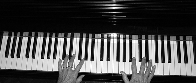
I like the light reflections on the piano's woodwork, and the panoramic format lends itself well to the subject. I would suggest rotating the keyboard to align it with the lower image frame.
I like the idea, and I like the way the light falls and splits on the top part of the piano, but it's very distracting down by the keys. Reposition the light perhaps?
I think the blacks and whites in this photo are great. I think a photo such as this should either be perfectly straight, or at an extreme angle to work. This could use some counterclockwise rotation, IMO
I can see the age and texture in the hands. The tones are good(hehe,tones). Maybe a different angle would have helped it seem a little more interesting?





 Add photograph to your favorites
 Add photographer to your favorites


 Photographer found comment helpful.


