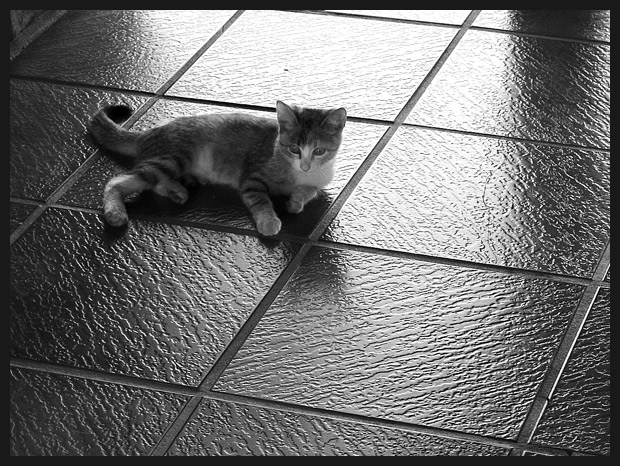
Kitty! I actually really liked this shot. I'm a cat person by nature. The thing that actually makes this work is the negative space. For me it gives kitty a sense of scale.
Two things: The black speck above the cat, and the heaviness of the shadow to the right, are a bit distracting. Otherwise, fantastic photograph and very eye-catching with regards to contrast and textures and lines. Cute kitty! What's it's name?
The name of this 3 month lady is Mimi (me-mee), given by my seven year old daughter. Thanks for comment.
This is a very nice photograph. I will say, however, that I find the title a little insulting to my intelligence. Don't you think the average viewer will "get it?". Maybe this is your sense of humor... maybe I just don't understand. In any event, based solely on the merits of the photograph, I give this one an 8
I had absolutely no purpose to insult nobody. I was just kidding with the challenge subject. Thanks for your comment about the photograph.
Two things: The black speck above the cat, and the heaviness of the shadow to the right, are a bit distracting. Otherwise, fantastic photograph and very eye-catching with regards to contrast and textures and lines. Cute kitty! What's it's name?
This is a very nice photograph. I will say, however, that I find the title a little insulting to my intelligence. Don't you think the average viewer will "get it?". Maybe this is your sense of humor... maybe I just don't understand. In any event, based solely on the merits of the photograph, I give this one an 8
Nice take on the challenge. Suggestions: crop or change angle to not include the edge of tile on upper left, take out the shadow on the top somehow. Otherwise an excellent image.
good framing, excellent light levels - bright but not blown out or over contrasted. Crisp and clear, but not harsh. Excellent use of negative space. 9. Good luck!
i always sucker for cats and this subject is 1 cutie
but, there is a shadow which is a distraction and a small part of a wall also minor distraction a better crop or a crop in general could have helped add to the pic.- just keep it in mind next time.
Nice composition and observation of interesting light. The bit of architecture in the upper left corner is a bit of a distraction in the overall theme of the image. It may have been worthwhile to crop that bit out...





 Add photograph to your favorites
 Add photographer to your favorites

 Photographer found comment helpful.


