| Author | Thread |
|
|
11/24/2004 08:37:52 AM |
|
By 'eck it certainly got an unjustified hammering! I still like it and feel it should have done much better, thanks for submitting it. |
|
 Photographer found comment helpful. Photographer found comment helpful. |
Comments Made During the Challenge  |
|
|
11/23/2004 11:59:56 PM |
|
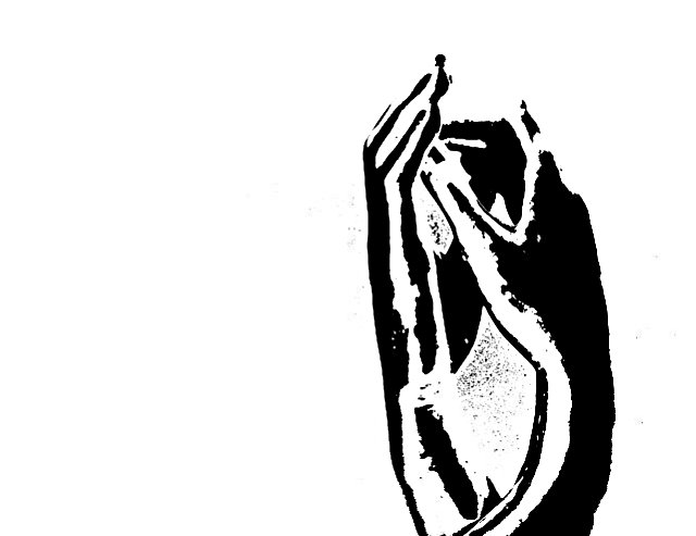
Pretty abstract. I pity your final score. I'm giving it a 7. I like the placement of the "thing" in the frame and the total lack of detail. |
|
| Photographer found comment helpful. |
|
|
11/23/2004 10:00:27 PM |
|
| Photographer found comment helpful. |
|
|
11/23/2004 04:49:07 PM |
|
|
|
11/22/2004 09:28:24 AM |
this works well as fine art, but it won't do well here i dont think.
|
|
| Photographer found comment helpful. |
|
|
11/21/2004 11:30:47 PM |
|
I can't even tell what this is. |
|
| Photographer found comment helpful. |
|
|
11/21/2004 12:53:59 AM |
|
This is a bold idea, but I'm not sure how well it comes across with all the negative space. Or in this case, positive space. Still, I like it. |
|
| Photographer found comment helpful. |
|
|
11/20/2004 07:50:53 PM |
|
I don't mind the technique at all, I just can't tell what it is. Sorta ruins the fun. OK I see at least one hand. Still. hmmm. I wish I could tell what it was, then I could give you a high score. I will look at your notes after the challenge. I gave you a 6 |
|
| Photographer found comment helpful. |
|
|
11/20/2004 06:38:56 PM |
|
| Photographer found comment helpful. |
|
|
11/20/2004 04:16:40 PM |
|
I don't think I understand this.. |
|
| Photographer found comment helpful. |
|
|
11/20/2004 11:59:15 AM |
|
Bold idea, but needs to be cleaner to work as a pure graphic. Try making an advanced-editing copy for your-self, with the noise between the hands edited out. |
|
| Photographer found comment helpful. |
|
|
11/19/2004 11:57:37 AM |
|
Fabulous image - it would have been even better if the additional pixels could have been eliminated particularly those on the outer edges of the hands but its still gorgeous - weel done. |
|
| Photographer found comment helpful. |
|
|
11/19/2004 05:08:33 AM |
|
Just way way way too much contrast for me. Personally I would almost call this digital art more than a photograph but because of that I believe this would probably do well at an art exhibit. |
|
| Photographer found comment helpful. |
|
|
11/18/2004 02:37:21 PM |
|
The photo is too over exposed. It definately could have used more lines, if you were going for an artistic pen and ink type look. As is I cant see enough details to tell me what it is I'm looking at. |
|
| Photographer found comment helpful. |
|
|
11/18/2004 02:33:34 PM |
|
They are hands, it appears, but the effect you employed is not doing this photo any favors. This isn't going to score well unfortunately. |
|
| Photographer found comment helpful. |
|
|
11/17/2004 09:30:38 AM |
|
For me, DPC is about photographic integrity. I feel that the upped contrast goes beyond that. 1 |
|
|
|
11/17/2004 01:02:54 AM |
|
nice shot very abstract but it just doesn't do it for me its to strong and to contrasty. |
|
| Photographer found comment helpful. |
Home -
Challenges -
Community -
League -
Photos -
Cameras -
Lenses -
Learn -
Help -
Terms of Use -
Privacy -
Top ^
DPChallenge, and website content and design, Copyright © 2001-2026 Challenging Technologies, LLC.
All digital photo copyrights belong to the photographers and may not be used without permission.
Current Server Time: 06/29/2026 12:09:57 AM EDT.