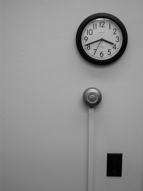
The form and texture are there. I think it would be more pleasing if the composition was futher over to the left. Maybe because I'm used to reading left to right? The pattern the three items make is interesting.
These utilitarian images are a good idea. With the clock image, I tend to think of time passing so I want the image to be way over to the left in the frame instead of the right. I want the wall to be crisp and white to make the dark images stand out. Nice concept, though. Keep working the idea.





 Add photograph to your favorites
 Add photographer to your favorites


 Photographer found comment helpful.