| Author | Thread |
Comments Made During the Challenge  |
|
|
11/22/2004 09:54:26 PM |
|
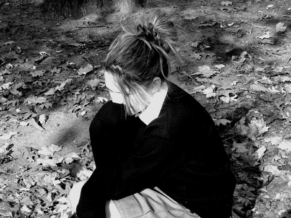
A bit overexposed. The texture is completely lost on the girl's face. |
|
|
|
11/20/2004 09:44:08 PM |
|
Her skin looks way too bright and that black top looses all detail so you can't tell where her arm is. It also doesn't look focused on the face to me. |
|
|
|
11/20/2004 02:26:01 PM |
|
I like the idea, but it could have been a bit more intimate by: 1) coming closer the young lady's face; or 2) lowering the exposure of both face/shirt and the back ground (to maintain the grey balance). |
|
|
|
11/19/2004 11:54:57 PM |
|
Her skin seems too white, her sweatshirt too black, but maybe that's how you wanted it. Good pose, but I would like to see her eyes. |
|
|
|
11/19/2004 08:57:53 PM |
|
Get the focus out of the center. Here is a trick, divide the composition equally into a tick-tack-toe board, where the lines meet, but your points of focus. This should be your rule, rules are made to be broken, but you have to know when and why. Technically a good peice. |
|
|
|
11/18/2004 12:52:24 PM |
|
Good moment caught on camera.. |
|
|
|
11/17/2004 03:51:18 PM |
|
her face is a little burned out on my monitor, and the sweater lacks detail. Maybe a bit of tweaking in curves would have brought out a little more detail? Nice composition |
|
|
|
11/17/2004 09:22:53 AM |
|
i like the shot, though would like to see more of the face. perhaps move the hair or something. contrast is really strong |
|
|
|
11/17/2004 09:19:59 AM |
|
Face of that nice girl is over exposed. But i like the composition... |
|
Home -
Challenges -
Community -
League -
Photos -
Cameras -
Lenses -
Learn -
Help -
Terms of Use -
Privacy -
Top ^
DPChallenge, and website content and design, Copyright © 2001-2026 Challenging Technologies, LLC.
All digital photo copyrights belong to the photographers and may not be used without permission.
Current Server Time: 07/01/2026 01:20:34 AM EDT.