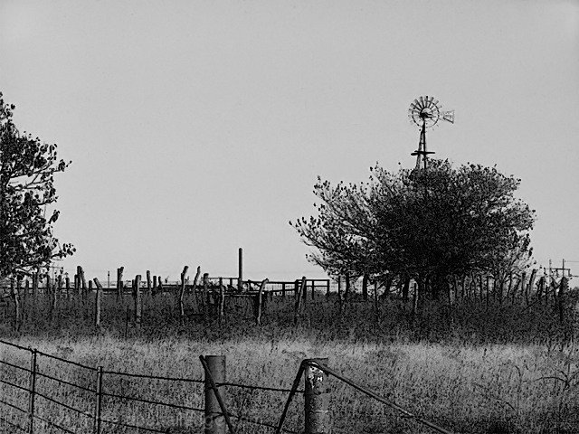
Removed color, filter-accented edges. Edge width 1, edge brigthness 16, smothness 2. Cloned one bird out, contrast and brightnes, dodged out the coners. Resized, saved for web. NI.
Statistics
Place: 133 out of 190 Avg (all users): 5.1198 Avg (commenters): 5.2727 Avg (participants): 4.8627 Avg (non-participants): 5.4111 Views since voting: 1038 Views during voting: 263 Votes: 192 Comments: 11 Favorites: 1 (view)
Not much of interest or seasonal relevance here for me. Ordinarily the month would be depicted by something that denotes a flavour of that time, but this actually looks quite barren and devoid of features.
I like the composition and contrasting textures. The coloring makes it look kind of cold (though dry); where I live August is supposed to be hot. I wonder how this would look duotoned with a warm/hot color....
looks as if this was sharpened too much. tone it down a little, maybe cropp some of the sky and that tree on the left some. also the BW appears a bit "flat" good subject though.
This photograph, to me, is far too "cool toned" for it's connection to "August". Looking at it, I feel a chill, and I had thought of a month like October, or March.. before August (I didn't see the title first, which is why I'm commenting).
A warmer tone, perhaps a duotone in the sepia/golden range, and you would have had a much higher score from me.
I liked the way you used the fence as a foreground element. Another option for composition might have been to change the angle a bit to separate the windmill from the tree, and eliminate the tall pole that is currently just left of center. Black and white was a good choice.
I think the image would be near perfect except two nit-piks: the constrast is just one tad too much in my opinion, making it appear over-sharpened, and the windmill looks like it is growing out of the tree.
Let me start with the score, get it out of the way, a six from me. Now as to why, I like this kind of image and have tried to make them myself. The graininess and poster like edges give it an interest thats hard to define. I feel that the cropping is a bit out, I think less sky and more of the interesting looking foreground fence would be better. Also changing position so that the windmill is not hidden behine the tree cound have given interest in the distance. Well done though, a good shot.







 Add photograph to your favorites
 Add photographer to your favorites


 Photographer found comment helpful.


