*Hello from Sid and the Critique Club*
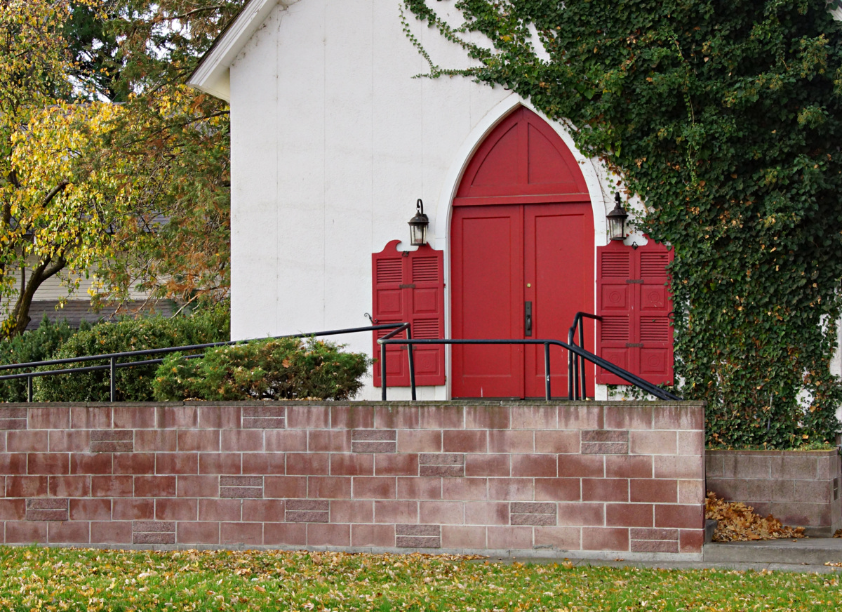
An appealing image that vaguely meets the challenge.
I feel a little undecided about this one whether I like it or not. There are elements of the composition I like, the shape of the red door with the ivy growing round it against the modern brick wall in front which I am not so keen on, I find the railings ugly and distracting. In fact, as it is, it only the shape of the door that gives a faint implication that this is a church at all, don't get me wrong, that is not a criticism, I quite like it for that.
I am wondering what a composition raised above the level of the railings including the roof which presumably has a cross or some sort of adornment would have looked like. I think in terms of the challenge, it would have come across much more clearly that it is a church. The red of the doors is very appealing and adds a lot to the image.
Apologies for the delay in this critique, thanks for your entry, Sid |