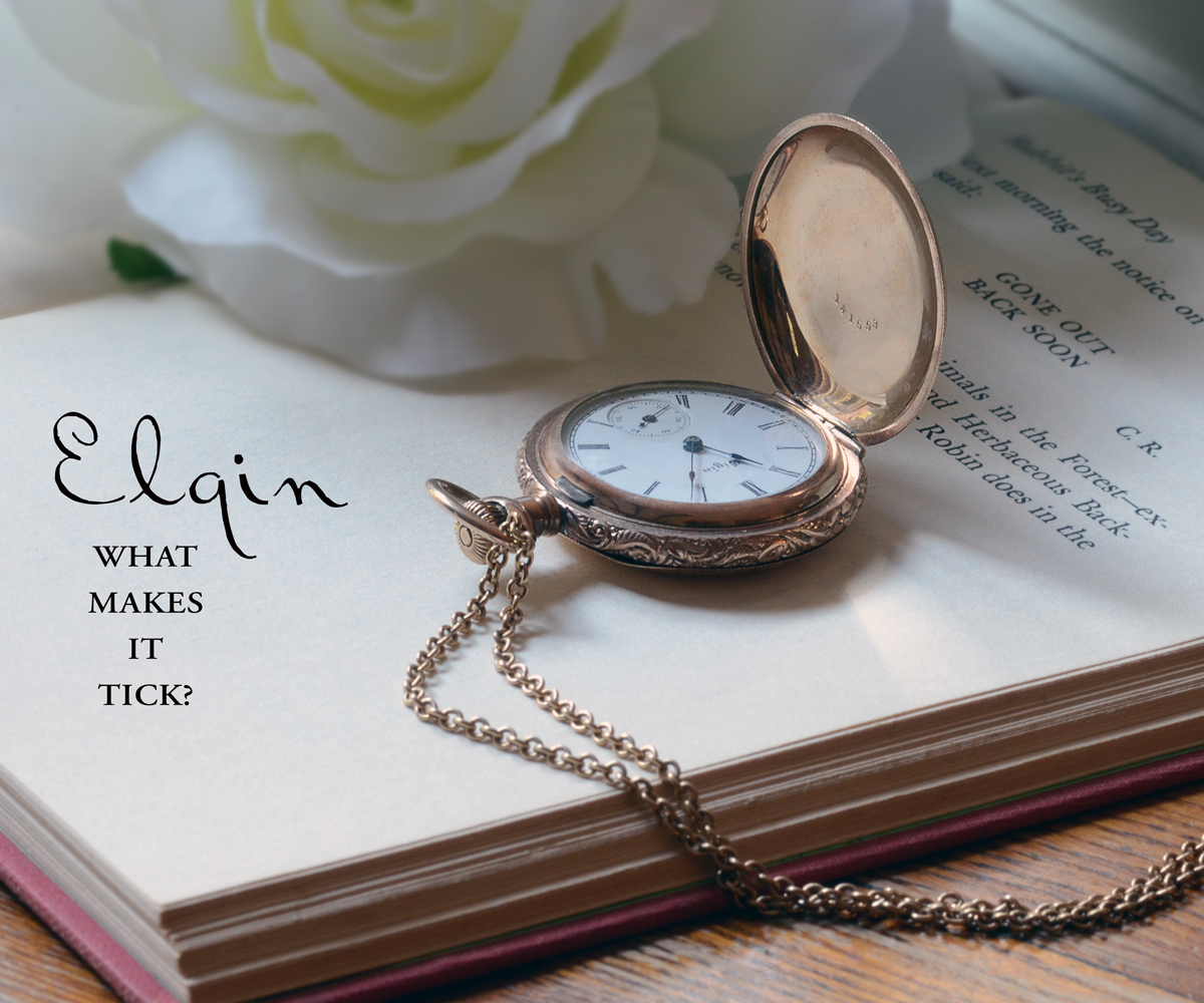
I like the idea of using a book. For me, it ends up a little busy, there is no connection between the text and the watch, and the partial flower is distracting.
The words are sharper than the jewelry... not a good sign in a jewelry advertisement that's supposed to be selling me something... and I can't see it.
Also, in general in photography, the brightest place in the image is where the eye goes first. The corner of the book is the brightest spot. I wish it were the clock face since the watch is fabulous!





 Add photograph to your favorites
 Add photographer to your favorites


 Photographer found comment helpful.


