DPChallenge: A Digital Photography Contest You are not logged in. (log in or register
 
Challenge Entries
Portfolio Images
Turn and Turn
Turn and Turn
clickodak


Photograph Information Photographer's Comments
Challenge: Right Angles III (Advanced Editing VII)
Collection: Portfolio
Camera: Canon EOS-6D
Lens: Canon EF 24-70mm f/2.8L USM
Location: Canada Montreal
Date: Sep 15, 2014
Aperture: 4.5
ISO: 800
Shutter: 1/13
Date Uploaded: Sep 15, 2014

I took this photo in the emergency stairs 25 floors in the building where the works I

I tried to take the advice of criticism DPC and offer this composition

Hope you'll like it

Statistics
Place: 41 out of 73
Avg (all users): 5.3804
Avg (commenters): 5.6667
Avg (participants): 5.3571
Avg (non-participants): 5.4000
Views since voting: 397
Views during voting: 145
Votes: 92
Comments: 4
Favorites: 0


Please log in or register to add your comments!

AuthorThread
09/28/2014 07:31:15 PM
Greetings from the Critique Club!

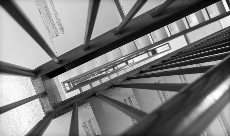
I think for the choice of right angles for the challenge, the decision to go with a staircase was a solid one. In fact it was the first idea that came to mind when I considered entering. So, I think your concept was great. It just lacked in the execution a little in my opinion.

The really great stairway shots typically have a lot of space between levels to look down over the railing, but here the space looking down is very small and cramped (as most emergency stairwells are), and so the viewer loses the ability to see a nice staircase winding its way down. We see just a fraction of the stairs, which is a pity. So, more space between the flights would've been so much more powerful.

The other thing is the very tight crop. You used a wide-angle lens and shot at 24mm, so you've obviously cropped quite a bit which makes the composition look very tight and "uncomfortable". I would've liked to have seen more of the stairs, since they'd give nice details, but also they would provide some more right angles to the railing. So a double-benefit!

Lastly, I felt the processing was a little bland. No real highlights or shadows, very flat. Would prefer a much more dynamic B&W treatment.

I'll be glad to discuss my comments with you via PM if you so wish. Hope you found this review helpful!

Kind regards,
Garry
  Photographer found comment helpful.
 Comments Made During the Challenge
09/18/2014 07:10:01 PM
Nice perspective and composition.
  Photographer found comment helpful.
09/17/2014 05:47:59 PM
I almost entered something similar. Same concept, different execution and style. I will post outtakes.
  Photographer found comment helpful.
09/17/2014 01:57:57 PM
Overall, it's a little flat. Looking through the narrow opening also makes me feel nervous. I almost feel like I'm gonna get stuck somehow, even though it's just a photo. Ahhh, let me out!

...I like the leading lines coming from (or going to) the left corners.
  Photographer found comment helpful.


Home - Challenges - Community - League - Photos - Cameras - Lenses - Learn - Help - Terms of Use - Privacy - Top ^
DPChallenge, and website content and design, Copyright © 2001-2025 Challenging Technologies, LLC.
All digital photo copyrights belong to the photographers and may not be used without permission.
Current Server Time: 07/31/2025 04:33:40 AM EDT.