EXIF
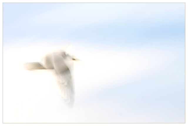
. Model Canon EOS 300D DIGITAL
. Date/time original 02.10.2004 14:21:09
. Shutter speed value 1/10 s
. Aperture value f/22
. ISO speed ratings 100
. Exposure bias value 2.00 EV
. Metering mode Pattern
. Flash Flash did not fire.
. Focal length 250 mm
. White balance Auto white balance
Statistics
Place: 130 out of 160 Avg (all users): 4.9016 Avg (commenters): 7.1600 Avg (participants): 4.6569 Avg (non-participants): 5.1758 Views since voting: 1818 Views during voting: 392 Votes: 193 Comments: 35 Favorites: 10 (view)
I thought I had already left a comment on this one! But I'll leave another. Very nice, and this is an excellent entry into the impressionistic project thread!
This is a very unfortunate score. I thought this was one of the best in the challenge. I guess that is the world of DPC for you. In any event, I hope you're proud of your effort... you should be.
Perfection. This is an excellent example of the correct creative exposure as explained by Brayn Petersen in Understanding Exposure. I didn't quite get what he was talking about until I saw this shot. I have no doubt that this shot will get nailed for "not being in focus" For me, this is one of the very best teaching shots on DPC. It's also darned nice. 10, my best in show.
Your picture does really have a nice airy feel to it. To my eyes, it might have been a bit better if the bird had been a bit more clearly defined with not quite as much motion blur.
I like the way this turned out. I'll be interested to see how other DPCers view it. To me, it's kind of an abstract pastel with a nice viewing quality.
this is a bizarre image, very similar to some of the ones i've been making, lately. nothing like jacking out the aperature and slowing down the shutter. i'm giving it an 8 just because you entered it. might have given you a 9 if you'd left off the border. good luck!
Good to try abstracts. It's a bit too "pastel" and light for my taste. It lacks perhaps a strong line or center of interest? Keep trying this way nevertheless
The idea was superb - it's very artsy. But it's just off the mark a bit. The "V" shapes from the bird's body and head are just too crisp-looking. the back end of the has just disappeared. The high key effect is nice.
Okay ... this is wierd!
Looks like a mouse with wings ... either I need more caffeine or it's time for bed : )
It's different for sure, and it certainly holds my attention, and to quote Hitch-Hikers ... "Actually, I quite like it". Looking forward to seeing the explanation behind this, well done.





 Add photograph to your favorites
 Add photographer to your favorites

 Photographer found comment helpful.


