Hello from the Critique Club - Sorry to be late with my review. Sometimes life intervenes.
This is an extraordinary photo! My first instinct is to only write "GASP!" and leave it at that. But probalby you want more words. Since it is perfect in my eyes, I can only tell you why I like it so much. I can't offer any suggestions for improvement.
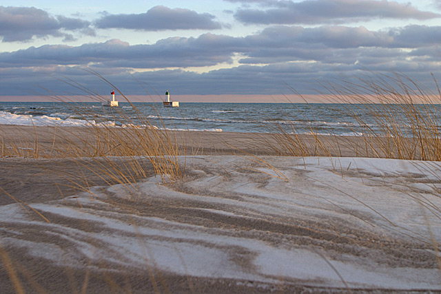
This image brings to mind the very tightly controlled japanese gardens where even the stones and dirt are raked into lines to compliment the plantings. You have created a wild version of that idea. Had you raked the snow and sand and waves and clouds into that perfect pattern you could not have made it more precise. I suppose those are tire tracks, but WOW, they are lovely as they snake from right to left. Yes, the movement in the picture is all right to left, rather than the more common left to right. The wind blows left, the lines point left, the bouys are left, the snowbank piles up left. Nice!
You have three elements here: foreground, mid ground and back ground and each is exquisite in it's own right, But you make them tie together and compliment each other so the sum is even more than the perfect parts. Foreground: swirlies, moving grasses, muted tans, absolutley in focus. Mid ground: Ocean - white caps mirror the snow banks, flecks of white pick up the snow and clouds, muted blues, bouys as a point on interest (in the rule of thirds place, too). Background: Mirrors the fore and mid grounds, stripe of tan stripe pf blue. Now the tan is narrow, like the ocean and the sky is wide like the beach. The swirls are in the blue clouds. Gorgeous.
Textures! WOW! look at all those textures - grass, sand, snow, waves, clouds. They all work together without competing or getting cluttered! I can HEAR this scene, whoosh wind, swish little waves, swoosh draw me in.
I love the colors, they all go together so well, tans and blues, such soft colors, such sharp focus. I love the muted light. Sunset? It must have been FREEZING yet the picture has a warmish inviting feel despite the snow. I like the two little dabs of man made colors, red and blue.
Okay, I have a pet peeve about tilted pictures and I agree with the commenter who said the horizon is just a hair tilted. There! I found something to improve.
I haven't finished my ratings of all the photos yet but this is currently my favorite. This is very, very good. I am so glad you didn't over saturate the colors and over sharpen the edges like so many people would have done. There is something incredible going on here visually. It seems to be both calming and energetic at the same time. The complimentary colors evoke the calming feeling and the wonderful textures in every area of the photo give the sense of energy and motion. The horizon line looks tilted slightly but the rest of the image more than makes up for it. I want to just keep looking at it. Excellent job! 10 -T
Nice, well balanced. Good colours. Perhaps it would hav ebeen better to frame it higher with more sky and slightly less foreground. Those clouds have a very nice shape and texture. The ground reminds me of a cinnamon bun...
This is a beautiful shot! The colors and shapes in the sand with the colors of the windblown weeds is outstanding! Sharp focus along with excellent detail in the water with a hint of focal point and perfect light direction. The clouds are in excellent position with a color that just complements the whole concept. Congratulations and good luck!
Very nice muted, pastel colors for a beach scene. I do like that you tried to include something in the foreground although the blurred blades along the very bottom aren't needed. I'm not really sure how to improve this. It needs a little more interest for me.
Beautiful shot. I think you have composed it well in that you have the picture divided in thirds, horizontally, which really adds to the interest level of the shot.







 Add photograph to your favorites
 Add photographer to your favorites

 Photographer found comment helpful.


