I don't think I have ever struggled with an idea as much as I struggled with this challenge topic! This is the result of many, MANY hours of thinking about absurd things...
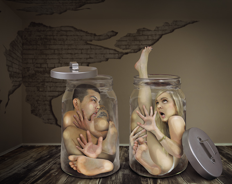
Thanks everyone! I am kind of proud of this one, as I basically had to shoot our body parts individually in many different positions and then piece together a puzzle that had yet to be created. It was interesting cutting and pasting parts! I had to make sure I never had two left hands or something.
For our faces I actually used a piece of glass and I had him mash his face against it as I took pictures. That was funny. :)
Statistics
Place: 1 out of 47 Avg (all users): 7.4331 Avg (commenters): 8.8000 Avg (participants): 6.6563 Avg (non-participants): 7.6947 Views since voting: 4401 Views during voting: 455 Votes: 127 Comments: 45 Favorites: 6 (view)
Interesting cell animation effect. I like that almost nothing is the correct proportion (the jar covers, the room as it relates to the people, etc). Editing wise, I think you did a better job on yourself than the guy. The way you laid out his body it doesn't seem like his face should be pressed up against the glass. The back of his head perhaps, but not the front of his face. Then again maybe that just makes it more absurd.
I'm so glad you won that one Samantha, the best one of that challenge by a mile or two! On top of that, very creative and funny: I bet this image will also be very successful outside of DPC :-)
WELL MY ONLY TEN AS THIS WAS PERFECT IN EVERY WAY CONGRATULATIONS AND WORTH ALL THE HOURS THINKING AND HAVING PAIN TO WORK OUT THIS IDEA AND THEN ACHIEVING IT THAT WAS AND IS A WINNER... XOX
I would LOVE to hear how you came up with this and how you did it!! I knew it was the Blue, Probaly the best crazy edit I've ever seen!! I seriously believe you really people in jars!!
She still managed to get a piece of jewellery in. Sheesh - Women!
The removal of blood from squashed heals and palms etc is particularly well done. Top5 Mr and Mrs T.
Well thought out and executed. Only nitpicks are the tops of the IKEA jars look pasted in, since they aren't edited in the same painterly way and the ceiling is too low (wouldn't even have been necessary to include). Front page material in any case.





 A Tight Squeeze
 Add photograph to your favorites
 Add photographer to your favorites


 Photographer found comment helpful.


