Congratulations on the ribbon, Christophe. A letterbox frame would have made it seem bigger - and brought out the frame haters LOL Darned if you do, darned if you don't . . . (my mom wouldn't allow stronger language than this)
Lovely shot, Christophe, and grats on the blue, but just curious as to why it seems so tiny?
Thanks Susan! It is not particularly tiny, it is 800 pixels wide. I suppose this impression comes from the fact I used a 2:1 ratio, resulting in only 400 pixels vertically.
Congratulations on a beautiful image Christophe. Reminds me a little bit of a landscape you did for the benefit of our Jawbones team ages ago. I'm sure you will remember the one I am referring to :)
Christophe, Congrats on winning yet again, and with a score that is below your overall average! Question for you- did you use a neutral ND filter for the horizon separation or just a standard ND filter? Or no filter at night?
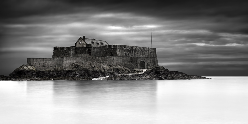
Thanks a lot Dennis. Yes, I used a ND 1000 filter. However, to get that contrasted horizon, I processed the RAW file 2 times, one time with normal exposure for the sea and fortress, and another time (lower exposure and much more contrast) for the sky. Then I blended them manually together.
Christophe, Congrats on winning yet again, and with a score that is below your overall average! Question for you- did you use a neutral ND filter for the horizon separation or just a standard ND filter? Or no filter at night?
Congratulations on the blue, Christophe. It's a striking image. I gave this a 5 because of the brightness of the foreground water relative to the dark stormy sky. In the real world, bodies of water take on the nature of the sky and are always slightly darker than the sky itself. It is perfectly okay to use artistic license to present the image in the way you wish. However, all the bright water vs. dark sky was unnatural to my eye, since there was no direct involvement of the sun. But, I may have lived in the mountains too long. Also, when viewing your scene, I "heard" the water splashing on the shore or boat, rendering it less than silent. Hope it's okay to offer this constructive criticism. Again, congratulations on your top score in this challenge.
I picked this as yours, I gave you an 8, lovely stuff, would of been higher if there was not so much white in the foreground.
So yes to answer Alex's question, I really thought you had a disdain for black and white photography!
Thanks Anita! I don't know why you would think that, I have several B/W photos in my portfolio, including portraits, still lifes, landscapes. No disdain at all. No love either: I consider B/W and colors as 2 different tools, and I use the one that works the best with what I want to achieve.
I've been there with the low tide and I reached the fortress.
The different ruleset are only a small detail for the blue ribbon catcher ;)
But this time I have a question for you: while your usual photos are almost always very colorful, your landscapes are often in B/W, why?
Thank you very much Alessandro!
In fact this photo is not in B/W: the fortress has some color in it. It is very desaturated though, but I didn't like the plain B/W version in that case.
I tend to use B/W in 2 different ways: by design (when I decide the photo will be in B/W before pressing the shutter, because I believe it will be stronger that way) or by default (when I don't find any convincing solution to manage colors: B/W is the easy fix). For this photo it was by default: the light was extremely flat that day (I had to heavily dodge/burn things to bring back something to look at), colors were really boring despite my different tries, so in the end I went with that solution.
It's true that I usually prefer color over B/W, simply due to the fact there is more information, more things to look at (unless I deliberately chose to go with a minimalistic approach, then B/W becomes a serious option). Moreover, processing wise, color gives you more flexibility, more possibilities to play with: even in Advanced Editing, each shape in the photo can have its own color modified independently (which I often do to end up with a very controlled whole), while when you're in B/W you can only adjust luminosity.





 Away
Away Add photograph to your favorites
 Add photographer to your favorites

 Photographer found comment helpful.


