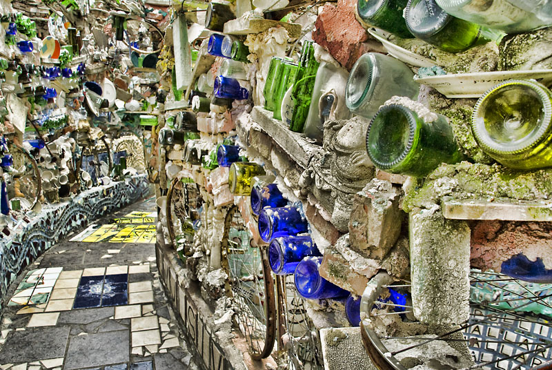
Looks like this must have been an HDR of some sort? The image is way too even for my tastes. The foreground blends with the background way too much. There's no depth. You might have been able to pull this off with a wide aperture so as to blur the background out. Even then, the light feels too even. The depths of the image would look better if darkened somehow, at least to separate it. Crop off the bottom half of this image with your hand. See what I mean? The top half of the image is basically the same all the way across. Not meaning to be harsh here, but I figured you may want an honest opinion.
Wow.... that's certainly an unusual use, but i could see this (if someone actually did it as an art exhibit) drawing a huge crowd of people and being a sort of photographic Meme for "photoshop this art exhibit into other places" :)
Great composition here with making this wall of stuff :)





 Add photograph to your favorites
 Add photographer to your favorites


 Photographer found comment helpful.


