Thank you for all the great comments and the votes! It was a great challenge with an added bonus of edible prop. I have not been that addicted to the update button in a while! :)
Statistics
Place: 2 out of 51 Avg (all users): 6.9683 Avg (commenters): 7.9130 Avg (participants): 6.8125 Avg (non-participants): 7.0213 Views since voting: 2233 Views during voting: 293 Votes: 126 Comments: 33 Favorites: 0
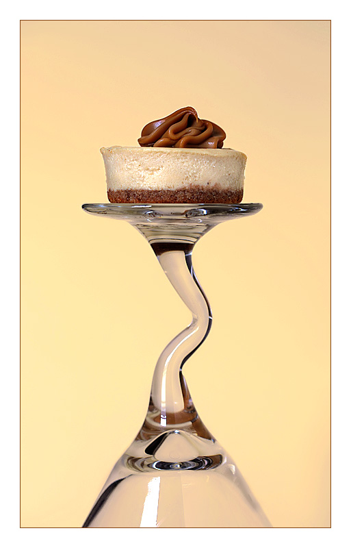
nice detail scoring an 8 as much as i like the up turned wine glass i know its a up turned wine glass and im thinking why is it on an upturned wine glass. you could have cropped it so was just the widdly stem and nit the glass.
This is a tough challenge to vote. I'm torn between "what are you trying to do here" and "what do I expect here". Further complicating matters is the question "what would I do here".
What I would expect would be a technically strong piece of eye-candy that would present the dessert in a way that I would want to at least sample it, if not order it. Along these lines I'm looking at technicals: backgrounds, distracting elements, exposure, sharpness. I'm also looking for creativity, imagination, and originality, which can make up for less than perfect technicals.
So, where does this leave me with your image?
Personally, this seems to be more about the glass than the dessert. Technically, it's a spot on image; compositionally, though, it would have been much stronger with only the top half.
Love the presentation of the dessert resting on the curved stem of the glass...I do think the visual appeal would be more stronger if you cropped more of the bottom portion so that it is just about 1/2 under the wavy stem. The dessert is very well lit and the details are tasty to look at. I am not so sure the yellow cream backdrop really allows the Caramello to truly shine. The BG does have a warm tone to it whereas a white backdrop would just make it feel cold. I think a deeper rich color such as a dark brown would have made the white portion of the cake really pop out while complementing the medium brown of the crust and topping.
I like it -- and I like the idea. The bottom half seems a little heavy. Did you try cropping up from the bottom a bit more? Also the white reflection on the bottom and the glass ruins the lines a bit. -7-





 Caramello
 Add photograph to your favorites
 Add photographer to your favorites

 Photographer found comment helpful.


