| Author | Thread |
|
|
10/07/2009 09:24:55 AM · #1 |
I received 5 comments on this during the Twisted II challenge and only two had anything to say about the photo regarding the actual photo technicals! Those two mentioned lighting and I suck at that which is fine...but to get 9-1's and so many low votes with not one comment regarding why is of no help.
Anyone want to take a peek? Twisted II also said CURVED lines and I wonder if the Challenge Title LITERAL nazis were the attackers!
Thanks to anyone willing to help out. (Can't get better with no constructive criticism which seems to be the norm these days.)
 |
|
|
|
10/07/2009 09:31:20 AM · #2 |
I know I've already commented but I do think the the DOF or lack of sharpness on the face was a problem. I know the focus was the curved lines in the hat and that's probably why you had the main focus there but it's usually a bit disconcerting to see a portrait type shot without a sharp focused face.
Just my two cents. |
|
|
|
10/07/2009 09:44:44 AM · #3 |
|
Certainly fit the challenge description, IMO. I suspect two things hurt it. I think the lighting was part of it, and the face you were making did not come off well. |
|
|
|
10/07/2009 09:45:07 AM · #4 |
I think Jaded housewife's comments were pretty accurate and tell a lot about why this one finished where it did. As for me I think the overall the photo is OK but the lighting is not great, the shadows near the eyes and the blown out areas on the chin and check make this appear as more of a snap shot. Lighting for portraits is a real art, on really good portrait the subject is painted with light in subtle ways that enhance the subject features like the eyes. Leaving a subtle shadow below the hat but still lighting the eyes so they come alive is tough but that is what separates a good image from a great image. Hope the information is helpful.
As for meeting the twisted competition it did IMHO meet the written description but I think a lot of voters never get past the title so it is always best to be very close to what the title says. |
|
|
|
10/07/2009 11:15:47 AM · #5 |
I'll add that, for me, the composition is also really unfortunate, kind of forcing us to focus in on the chin, of all things. Basically, all that neck down there is a profoundly negative force in this picture, compositionally. I tried cropping up to the chin and off the left side too, and it seemed to me to get much stronger. Bute even with all of that, it's just not a very satisfying image for me, largely because of the previously mentioned lighting and focus issues.
R. |
|
|
|
10/07/2009 11:29:02 AM · #6 |
It may have been the expression. A lot of voters are turned off by shots that aren't just eye candy. Smiles are contagious : )
I would have experimented with just shooting the cool hat from different angles and with differing lighting and experimented with B&W conversion for that challenge. That hat has potential as an abstract art subject.
Ditto what Robert said too.
|
|
|
|
10/07/2009 11:37:18 AM · #7 |
Originally posted by MelonMusketeer:
That hat has potential as an abstract art subject. |
It's fun hat, a Kat trademark, even.
 |
|
|
|
10/07/2009 11:40:49 AM · #8 |
|
Left you a huge comment with my opinion. Hope it doesn't sound stupid! |
|
|
|
10/07/2009 11:50:56 AM · #9 |
|
The expression here seems miffed or confused and it's hard to reconcile with the title. |
|
|
|
10/07/2009 11:58:59 AM · #10 |
Originally posted by Yo_Spiff:
Originally posted by MelonMusketeer:
That hat has potential as an abstract art subject. |
It's fun hat, a Kat trademark, even.
|
Where'd you find this!!! :P
Thanks all! I was using remote shooting (first time) and if I didn't look at the camera directly, I could see what was happening very well. The hat alone (tried that too) didn't seem to be as interesting as I thought it would. The llghting below was harsh. :) The room I had to shoot in was tiny and thus it all sucked. You have helped. (Bear...would like to see your crop idea.) I am terrible at choosing where to crop images.
All of my shots appear soft focus, thus I am going to get my eyes check when I can afford it. I'm wondering if the bright low light made it appear softer? Who knows...I did have one with a smile, but I thought it looked too cheesy, maybe not. (Will put in my profile for folks to laugh at, lol!)
Thanks all for taking the time to explain what no one seemed to have time to say. :) AND to those that did comment, THANK YOU! :) |
|
|
|
10/07/2009 12:05:11 PM · #11 |
|
Kat--got your email. Will send one back. :) |
|
|
|
10/07/2009 12:12:10 PM · #12 |
Originally posted by PapaBob:
I think a lot of voters never get past the title so it is always best to be very close to what the title says. |
Yup how about the "Straight II" challenge "Capture an image that includes only straight lines" .... the winners are truly gorgeous but of the three only one approaches consisting of only straight lines. |
|
|
|
10/07/2009 12:33:25 PM · #13 |
Originally posted by ineedauniquename:
Yup how about the "Straight II" challenge "Capture an image that includes only straight lines" .... the winners are truly gorgeous but of the three only one approaches consisting of only straight lines. |
Hmmm...those lamps don't have all straight lines on them. ??? 
|
|
|
|
10/07/2009 12:57:06 PM · #14 |
Originally posted by glad2badad:
Originally posted by ineedauniquename:
Yup how about the "Straight II" challenge "Capture an image that includes only straight lines" .... the winners are truly gorgeous but of the three only one approaches consisting of only straight lines. |
Hmmm...those lamps don't have all straight lines on them. ??? |
Yep there is a tiny ammount of curve in the bevelled edges, I considered cropping that portion out but overall the image consists nearly entirely of straight lines and besides its was never thatgood a photo to be able to win so I thought I'd take the hit.
Don't get me wrong I would consider it a disgrace if my image had scored higher than the ribboners but nevertheless none of the ribboners actually satsified the challenge description, jolly good match to the title and really really good photos - cripes I'm so afraid of being misunderstood in this.
Trick is not to take this too seriously I suppose, ah and btw I've just noticed a bird sitting on the last lamp now that isn't straight by any stretch of the imagination. |
|
|
|
10/07/2009 01:44:12 PM · #15 |
Originally posted by bergiekat:
Where'd you find this!!! :P |
About 5 feet from you and Ken, on a bridge over a bayou. I think you have now found all the photos I had of you hiding in my portfolio. (I may have a few others I could post, however.)
It is now time to take my career as a stalker to the next level.
Message edited by author 2009-10-07 13:44:57. |
|
|
|
10/07/2009 02:18:12 PM · #16 |
Originally posted by Yo_Spiff:
Originally posted by bergiekat:
Where'd you find this!!! :P |
About 5 feet from you and Ken, on a bridge over a bayou. I think you have now found all the photos I had of you hiding in my portfolio. (I may have a few others I could post, however.)
It is now time to take my career as a stalker to the next level. |
OMG.....lol....so where do I send your "goodie basket" of bribery, lol. |
|
|
|
10/07/2009 07:02:03 PM · #17 |
|
I don't see any twisting lines, lots of curvy lines but no twists. I didn't read any of the replies so please excuse me if I'm repeating what has been already pointed out. Love the shot though. |
|
|
|
10/07/2009 07:42:19 PM · #18 |
Originally posted by Jac:
I don't see any twisting lines, lots of curvy lines but no twists. I didn't read any of the replies so please excuse me if I'm repeating what has been already pointed out. Love the shot though. |
 jacyou kind of confirmed my point made in an earlier post about how people vote more to meet the title and do not place as much importance on the description which in this case said "includes curved or twisted lines". So when I look at a challenge to create an image I try to put more priority on the title because I think it will connect with more voters. jacyou kind of confirmed my point made in an earlier post about how people vote more to meet the title and do not place as much importance on the description which in this case said "includes curved or twisted lines". So when I look at a challenge to create an image I try to put more priority on the title because I think it will connect with more voters.
|
|
|
|
10/08/2009 07:36:16 AM · #19 |
Originally posted by PapaBob:
Originally posted by Jac:
I don't see any twisting lines, lots of curvy lines but no twists. I didn't read any of the replies so please excuse me if I'm repeating what has been already pointed out. Love the shot though. |
jacyou kind of confirmed my point made in an earlier post about how people vote more to meet the title and do not place as much importance on the description which in this case said "includes curved or twisted lines". So when I look at a challenge to create an image I try to put more priority on the title because I think it will connect with more voters. |
I stopped reading the descriptions long ago. Title should say it all. A twist is not the same as a curve so the title should have been Twists and Curls or Twisted and Curved and not just Twisted. I think I'll participate in challenges that have no description apart from the title from now on since so many twist the description to their pov and block out all other interpretations, and then give many legitimate entries a low score. Typical DPC behaviour. |
|
|
|
10/08/2009 08:57:35 AM · #20 |
Originally posted by Jac:
I stopped reading the descriptions long ago. Title should say it all. |
Interesting, because I give more weight to the description. A title is just a title, and it may only have a tenuous connection. The description tells you (in theory) exactly what the objective is.
I do think the objectives for the twin challenges this past week were not equal. One said to merely include curved or twisted lines. The other said your composition should be composed only of straight lines. A big difference that made one challenge way harder than the other.
Message edited by author 2009-10-08 09:00:16. |
|
|
|
10/08/2009 10:40:58 AM · #21 |
Originally posted by Jac:
Originally posted by PapaBob:
Originally posted by Jac:
I don't see any twisting lines, lots of curvy lines but no twists. I didn't read any of the replies so please excuse me if I'm repeating what has been already pointed out. Love the shot though. |
jacyou kind of confirmed my point made in an earlier post about how people vote more to meet the title and do not place as much importance on the description which in this case said "includes curved or twisted lines". So when I look at a challenge to create an image I try to put more priority on the title because I think it will connect with more voters. |
I stopped reading the descriptions long ago. Title should say it all. A twist is not the same as a curve so the title should have been Twists and Curls or Twisted and Curved and not just Twisted. I think I'll participate in challenges that have no description apart from the title from now on since so many twist the description to their pov and block out all other interpretations, and then give many legitimate entries a low score. Typical DPC behaviour. |
I agree, the twist title and the description for twist were not even what you would expect, it was like having a Blue challenge and saying in the description include something that is blue or green in your photo. You could go with green if you read the description but you would get hammered in voting because you did not have a blue subject. Moral of the story stay close to the title........ |
|
|
|
10/08/2009 12:18:02 PM · #22 |
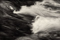
I didn't want to abuse the thread for my own purposes, so I waited a while before presenting my own, similar example entered in the September Free Study. Forgive my frankness, but I thought, and still think, of this as a wonderful image. If you don't agree and have the time, please, rip into it, so I may see with your eyes.
|
|
|
|
10/08/2009 03:17:48 PM · #23 |
|
|
|
10/08/2009 03:33:00 PM · #24 |
I agree that your photo should have scored better, Zeuszen.
Since this was a free study advanced editing challenge, the DPC crowd may have been extra picky about the technical quality of the photo (and they are very anal about technicals to start with!). The bright white reflection in the top left and the grain in the dark parts may be a bit distracting, but the rest is wonderful. It looks just like an oil painting! |
|
|
|
10/08/2009 03:38:15 PM · #25 |
Originally posted by johst582:
I agree that your photo should have scored better, Zeuszen.
the DPC crowd may have been extra picky about the technical quality of the photo (and they are very anal about technicals to start with!). The bright white reflection in the top left and the grain in the dark parts may be a bit distracting, but the rest is wonderful. It looks just like an oil painting! |
I'd say if he did what he wanted to do and achieved the look he wanted, it's technically perfect. |
|
Home -
Challenges -
Community -
League -
Photos -
Cameras -
Lenses -
Learn -
Help -
Terms of Use -
Privacy -
Top ^
DPChallenge, and website content and design, Copyright © 2001-2026 Challenging Technologies, LLC.
All digital photo copyrights belong to the photographers and may not be used without permission.
Current Server Time: 07/06/2026 07:49:14 PM EDT.


