| Author | Thread |
|
|
04/05/2004 10:37:10 AM · #1 |
Greetings...
There were some good panning shots in the motion blur challenge, but a lot of them could have been much better with some compositional thoughts in mind when shooting...
The most common issue I see in these is a composition/crop that is too tight. A good composition of a moving subject usually leaves some room in the frame for the movement. If the subject is moving left to right, some open space on the right of the frame seems to enhance the photo.
Just a thought...
|
|
|
|
04/05/2004 10:49:14 AM · #2 |
That very much depends on the photo John. It's nice of you to quote compositional rules John, but the problem is that each photo has to be taken on its own merits. One of the best wildlife photos that I ever saw completely disobeyed that rule -- the reason that it worked was that it created suspense rather than boredom in the image.
However in the case of DPC, I have to agree with you, boredom and the usual compositional rules work best. |
|
|
|
04/05/2004 10:51:33 AM · #3 |
Originally posted by sn4psh07:
However in the case of DPC, I have to agree with you, boredom and the usual compositional rules work best. |
i agree, there should also be a way that the avg score with commenters, and without cameras is averaged into your final score, as my photo came in 12th, but the two other averages, beat everyone in the top 10. |
|
|
|
04/05/2004 11:10:42 AM · #4 |
Originally posted by sn4psh07:
That very much depends on the photo John. It's nice of you to quote compositional rules John, but the problem is that each photo has to be taken on its own merits. One of the best wildlife photos that I ever saw completely disobeyed that rule -- the reason that it worked was that it created suspense rather than boredom in the image.
However in the case of DPC, I have to agree with you, boredom and the usual compositional rules work best. |
Everytime the 'rules' are mentioned, someone always brings up some photo that breaks all the rules and is considered good. Just as there are many more millionaires who earned their money than there are millionaire lottery winners, following the rules is the best bet 98% of the time.
If you think breaking hte rules is the way to go, for the next 6 challenges you should submit photos that don't follow any of the rules and see how you do. report back to us please!
chris |
|
|
|
04/05/2004 11:21:21 AM · #5 |
I agree with John. Leaving some open space in front of a moving object while panning add a sense of "going some place" or gives the feeling that the object has somewhere to go.
|
|
|
|
04/05/2004 11:26:30 AM · #6 |
I agree that compositional rules can be thrown out the window in some cases. I didn't see any of those cases in this challenge tho.
|
|
|
|
04/05/2004 11:30:18 AM · #7 |
Oops... I lied
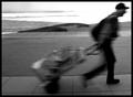
This photo is one that i really liked and it doesn't follow the 'guideline' for motion.
|
|
|
|
04/05/2004 11:45:54 AM · #8 |
Originally posted by jmsetzler:
Oops... I lied
This photo is one that i really liked and it doesn't follow the 'guideline' for motion. |
And that one also did not need it in my opinion, since the motion here is used to create an anonymous atmosphere, possibly someone with his whole belongings on a trolly on the road to nowhere. The motion was not used to create a feeling of speed or a movement towards something.
|
|
|
|
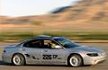
04/05/2004 11:54:37 AM · #9 |
Originally posted by jmsetzler:
The most common issue I see in these is a composition/crop that is too tight. A good composition of a moving subject usually leaves some room in the frame for the movement. If the subject is moving left to right, some open space on the right of the frame seems to enhance the photo. |
I guess I have to agree with you John. When I edited my Motion Blur entry I cropped it too tightly in front of the subject. You stated as much in the comment that you kindly left on my entry (BTW, thank you for the comment.) I cropped it tight because I wanted as much detail as possible of the boat, and less background and open water in the foreground. Since then I have re-edited the photo, but I’m not sure that I made it any better. I think perhaps I went too far in the other direction. What do you think?
Original entry

Re-edited

|
|
|
|
04/05/2004 12:07:48 PM · #10 |
Originally posted by jmsetzler:
Greetings...
There were some good panning shots in the motion blur challenge, but a lot of them could have been much better with some compositional thoughts in mind when shooting...
The most common issue I see in these is a composition/crop that is too tight. A good composition of a moving subject usually leaves some room in the frame for the movement. If the subject is moving left to right, some open space on the right of the frame seems to enhance the photo.
Just a thought... |
I'd also suggest that it might be because it is damn hard to get a good panning shot, period - never mind one with careful subject placement. A lot of technique, a good dose of experience, and a sprinkling of luck is needed for everything to fall in to place.
|
|
|
|
04/05/2004 12:16:13 PM · #11 |
Originally posted by Gordon:
I'd also suggest that it might be because it is damn hard to get a good panning shot, period - never mind one with careful subject placement. A lot of technique, a good dose of experience, and a sprinkling of luck is needed for everything to fall in to place. |
So true...
I was lucky to even find that I had gotten my subject in the shot fully and in focus let alone plan if he was in the proper third. |
|
|
|
04/05/2004 12:17:30 PM · #12 |
For me, Destination Unknown is about movement against some sort of difficulty, resistance, or obstacle. When I first saw the image during the challenge it was the cart the man is pulling that first caught my eye. My eye then traveled up the line of the cart, up to his back and finally up to his head in the upper right corner creating a line of upward incline. There are other such lines in the image that support this as well, such as his right leg, black object in the midground and even the sidewalk he’s on seems to be slightly inclined. The man’s body posture too is so inclined to make us believe there is some effort he’s expending against a resistance, even if it’s just the heavy cart he’s lugging. So too, his body being right up against the right frame border helps to support this idea and had the man been positioned with some space between him and the frame, it would not have had the same effect.
|
|
|
|
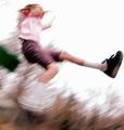
04/05/2004 12:31:36 PM · #13 |
John,
I agree with you 100%, but my problem was my daughter got tired of jumping out of the swing and my timing was terrible. lol Van
|
|
|
|
04/05/2004 12:48:34 PM · #14 |
Originally posted by jmsetzler:
Oops... I lied
This photo is one that i really liked and it doesn't follow the 'guideline' for motion. |
John, your thread opening statement still holds true. This shot is not a pan shot.
The subject blur and crop works here. I think because it gives the feeling of a reluctant subject hurrying to get off the image. Somewhat against the rules, but works nicely. Tom |
|
|
|
04/05/2004 02:07:00 PM · #15 |
I think that shot of the person pulling the load is a perfect example of why learning the cliff notes version of composition leads to dull pictures.
The idea about having moving subjects with space to move into, only makes sense if you want an open, comfortable feel.
In this shot, I think it adds a whole lot feel to the shot to have him essentially leaving the frame, when you don't know where he is going. The subject is already obscured by the blur, giving him nowhere to go furthers the feel of the shot. With plenty of room for him to move in to and being composed more to the right, would actually reduce the impact of the shot, not improve it, at least for me, and in this particular case.
yes the idea of a subject with space to move is considered 'compositionally correct' but only for certain subjects, under certain conditions - its more valuable to know why it works and when to use it than to say it is 'right' or 'wrong' because of standard guidelines. Go beyond the superficial - understand what makes these guidelines work and learn when to use them or not - then you'll get more effective compositions, on demand - not by accident.
|
|
|
|
04/05/2004 04:34:27 PM · #16 |
You are right John and thank you for the comment. I was editing in a "event photographer" mood. Get what the people want to see... not necessarily an artists vision. I will have to go back and play with it some more one day.
This is it BTW.
 |
|
|
|
04/05/2004 04:39:21 PM · #17 |
Originally posted by micknewton:
Original entry
Re-edited
|
I like the second one better, but if it were mine, I'd probably crop the top and bottom off to create a more focused panoramic feel, which would add to the feeling of speed...
I also like your color adjustment on the re-edit.
Edit: A quick crop I did...
Message edited by author 2004-04-05 16:44:21.
|
|
|
|
04/05/2004 10:45:25 PM · #18 |
I would like to comment on my photo.
The photo was cropped like this for the simple reason that I thought it fit this particular image. I wanted to create a feeing that the subject has entered the seen and was exiting.
John's original post was:
"The most common issue I see in these is a composition/crop that is too tight. A good composition of a moving subject usually leaves some room in the frame for the movement. If the subject is moving left to right, some open space on the right of the frame seems to enhance the photo"
In general, I agree with John, but this photo I feel was an exception.
John, when you commented on this photo during the voting period you wrote:
"The motion blur in this photo is nice. Compositionally, I would prefer some open space on the right side of the frame rather than the left. It would give the subject room to 'move' within the frame... = 7"
You then changed your mind and later in this thread wrote:
I agree that compositional rules can be thrown out the window in some cases. I didn't see any of those cases in this challenge though.
Oops... I lied
This photo is one that I really liked and it doesn't follow the 'guideline' for motion
I'm kind of curious as to why you changed your mind.
Thanks.
|
|
|
|
04/05/2004 11:03:08 PM · #19 |
Originally posted by qmdi:
I'm kind of curious as to why you changed your mind.
Thanks. |
It's one of those photos that took a while to sink in. I didn't grasp it right away. A lot of photos I see have that effect. I like them to some extent, but over time, they grow on me. This is an example of that.
|
|
|
|
04/05/2004 11:26:19 PM · #20 |
Originally posted by Ami Yuy:
I like the second one better, but if it were mine, I'd probably crop the top and bottom off to create a more focused panoramic feel, which would add to the feeling of speed... |
I like your crop better than either of mine. It retains more of the detail and primacy of the boat, while opening up the composition in the direction of travel. I still prefer a 1.25:1 or 1.50:1 aspect ratio, unfortunately, neither works very well with this photo.
Originally posted by Ami Yuy:
I also like your color adjustment on the re-edit. |
I do too, but I was afraid it would get too many “photographic integrity” comments.
Thank you for your input. It is very much appreciated.
|
|
|
|
04/05/2004 11:37:12 PM · #21 |
My pleasure. ^_^
Originally posted by micknewton:
Originally posted by Ami Yuy:
I also like your color adjustment on the re-edit. |
I do too, but I was afraid it would get too many “photographic integrity” comments. |
I wouldn't think anyone would have a problem with what you did, in general it seems to me that adjustments to contrast and saturation improve upon a photo when they bring out the natural colors.
My higest scorers:

and my current entry in "Out of Place" both benefited from my use of those tools.
|
|
|
|
04/05/2004 11:59:43 PM · #22 |
Originally posted by Gordon:
Originally posted by jmsetzler:
Greetings...
There were some good panning shots in the motion blur challenge, but a lot of them could have been much better with some compositional thoughts in mind when shooting...
The most common issue I see in these is a composition/crop that is too tight. A good composition of a moving subject usually leaves some room in the frame for the movement. If the subject is moving left to right, some open space on the right of the frame seems to enhance the photo.
Just a thought... |
I'd also suggest that it might be because it is damn hard to get a good panning shot, period - never mind one with careful subject placement. A lot of technique, a good dose of experience, and a sprinkling of luck is needed for everything to fall in to place. |
Thanks for the post, John.
Gordon, Makes me feel better to see that in writing. I'm reading up on the technique and have been to one more horse show and two rodeos recently to work on the experience. The indoor lighting is kicking me. The next rodeo is outside. Looking forward to that one. Can't do much about the luck part, though. |
|
Home -
Challenges -
Community -
League -
Photos -
Cameras -
Lenses -
Learn -
Help -
Terms of Use -
Privacy -
Top ^
DPChallenge, and website content and design, Copyright © 2001-2026 Challenging Technologies, LLC.
All digital photo copyrights belong to the photographers and may not be used without permission.
Current Server Time: 04/28/2026 10:59:19 AM EDT.


