| Author | Thread |
|
|
06/10/2008 05:10:49 PM · #26 |
Originally posted by FocusPoint:
I think once more I am disagreeing with Achoo about this photo.
DPC rules to get good place
1-eye candy
2-very sharp
3-very clear
4-very clean
a perfect sample

DPC voting rules don't include (or include in somewhere rule #259) that image can be taken in very difficult situation, with big affords, and very interesting subjects, unless if the challenge subject set for those rules(!)
Again, it's an awesome photo but not clear, sharp, clean... etc.
I am surprised you actually didn't know that Dr. :O |
While that may be true most of the time, sometimes the voters can surprise you. |
|
|
|
06/10/2008 05:11:21 PM · #27 |
Originally posted by option:
Originally posted by Bear_Music:
Originally posted by option:
I'm going to take this opportunity to complain about my own shot...  Mephisto has my back, though! Mephisto has my back, though!
5.2? Really?? |
I don't think that's so far off, myself. This is an overwhelming, powerful scene and it has been rendered so flat and lifeless it's almost disturbing... There HAS to have been more potential here, processing-wise, surely?
R. |
Could you elaborate on the flat and lifeless part? Personally, I thought the processing was fairly well done: the sky pops, good contrast in the snow / debris... the figures stand out well. My biggest concern is that shown as a portrait, you can't see all of the avalanche crown. |
Can we see the original?
|
|
|
|
06/10/2008 05:12:43 PM · #28 |
Originally posted by Citadel:
Can we see the original? |
Sure, gimme a minute. |
|
|
|
06/10/2008 05:18:05 PM · #29 |
What might work on a big canvas gets really creamed at 720 pixels. First time I saw this shot, I thought the snowboarders were part of a snow-covered stump. It was not at all clear what we were looking at. And why are 3 figures standing at the bottom of an avalanche anyway? The story isn't told. Also the avalance snow dominates the scene and has a very unpleasing texture. It looks like noise.
|
|
|
|
06/10/2008 05:24:13 PM · #30 |
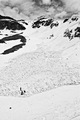
Originally posted by DrAchoo:
What might work on a big canvas gets really creamed at 720 pixels. First time I saw this shot, I thought the snowboarders were part of a snow-covered stump. It was not at all clear what we were looking at. And why are 3 figures standing at the bottom of an avalanche anyway? The story isn't told. Also the avalance snow dominates the scene and has a very unpleasing texture. It looks like noise. |
Well, its supposed to show 3 people in the backcountry searching avy debris for another rider, but I guess I assumed incorrectly that would translate from the photo. At any rate, I'm not all that concerned with the processing, and those that got the shot liked it... I just made a mistake thinking the voters would understand what's going on in the photo.
Heres the original, zeroed in LR, sized to 1600px:
//farm4.static.flickr.com/3078/2568075337_7d822bb129_o.jpg
Serves me right for assuming, though... I should've just entered something cliche like this.

Message edited by author 2008-06-10 17:39:28. |
|
|
|
06/10/2008 05:46:29 PM · #31 |
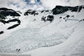
[thumb]687662[/thumb]
I took a stab at it. Provides more contrast (I agree with Bear your image is flat), but I'm still not sure it would have scored above 5.5. Tough subject...
I just did a quick job, there is halo at the top I'd remove, blah blah blah...
Message edited by author 2008-06-10 17:47:17.
|
|
|
|
06/10/2008 05:57:07 PM · #32 |
Originally posted by DrAchoo:
[thumb]687662[/thumb]I took a stab at it. |
Much better IMO. |
|
|
|
06/10/2008 10:33:53 PM · #33 |
Whoof... I got sidetracked in a tournament. This is what I did: no cropping, no B/W, just working with available tones to get more impact and drama:
FWIW
R.
|
|
|
|
06/11/2008 04:49:47 AM · #34 |
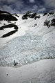
2 shots later, landscape.
More clear whats going on?
Message edited by author 2008-06-11 04:50:11. |
|
|
|
06/11/2008 05:32:14 AM · #35 |
Originally posted by option:
2 shots later, landscape.
More clear whats going on? |
This one makes more sense to me, when I first saw the first one I couldn't quite work out what it was about.There's no snow where I live so I need to see the whole story to understand it. |
|
|
|
06/11/2008 05:32:20 AM · #36 |
@DrAchoo @Bear, why push it in a very contrasty direction? It's snow. It's prettiest when it's pure white not grey and certainly not yellow. I have to say I much prefer option's entry over these edits. The whites are white and the blacks are black.
ETA: That said I'm sure those edits would have fetched a higher score. I just don't think it really suits the subject and the tones are somewhat inconsistent, IMO.
Message edited by author 2008-06-11 05:47:09.
|
|
|
|
06/11/2008 10:06:21 AM · #37 |
Originally posted by option:
2 shots later, landscape.
More clear whats going on? |
This one is better. The one you entered is to flat and the reason is the comp and the lighting. I would hazzard a guess in this shot the clouds ar covering the sun a bit more and thus allowing for better lighting also with the landscape orientation you see more depth to the image and not just what appears to be a mostly flat wall of snow. |
|
|
|
06/12/2008 01:44:08 PM · #38 |
Originally posted by DrAchoo:
At the risk of raising an arguement that is as old as photography (and definitely discussed many times here), sometimes altering a picture does capture what you see. The human eye is not capable of freezing water so taking a shot at 1/1000th is no more reality than 1 second. It may be the flowing water is actually closer to what is captured by our mind's eye. I also regularly manipuate the greens in my pictures because to me the green/yellow that shows up in photoshop is nothing like the way I see the mossy greens when I'm walking through the woods on a wet morning.
Just my 0.02. So while this photo definitely qualifies as being manipulated through shutter speed and photoshop, it captures what I saw when I was there. Even the turquoise line in the water, which I sorta wanted to get rid of, does a better job of reflecting the incredible tones that were in the water where the bubbles reflected the moss and sky above.
 |
It might be similar to what you saw in person but it does not represent the scene. Just look at az highways. They rarely do any processing with pics and they actually do represent the scene but they are bland. Its dumb when everyone says it is what the human eye saw. Rarely do you see pics that reflect what the human eye witnessed. Usually those score a 4 on here. |
|
|
|
06/12/2008 01:58:45 PM · #39 |
Originally posted by nemesise1977:
Originally posted by option:
2 shots later, landscape.
More clear whats going on? |
This one is better. The one you entered is to flat and the reason is the comp and the lighting. I would hazzard a guess in this shot the clouds ar covering the sun a bit more and thus allowing for better lighting also with the landscape orientation you see more depth to the image and not just what appears to be a mostly flat wall of snow. |
Yeah, I'd have to agree. I like this one far more. Even if you don't see the people in the shot, there's a lot to visually explore in this one.
|
|
|
|
06/20/2008 11:50:40 AM · #40 |
Originally posted by Citadel:
Originally posted by nemesise1977:
Originally posted by option:
2 shots later, landscape.
More clear whats going on? |
This one is better. The one you entered is to flat and the reason is the comp and the lighting. I would hazzard a guess in this shot the clouds ar covering the sun a bit more and thus allowing for better lighting also with the landscape orientation you see more depth to the image and not just what appears to be a mostly flat wall of snow. |
Yeah, I'd have to agree. I like this one far more. Even if you don't see the people in the shot, there's a lot to visually explore in this one. |
Much better in the outtake. I did vote the original fairly low for the reasons others have mentioned. I also thought the people were bushes/rock and had a totally different sense of scale after the OP mentioned snowboarders. That is a tough thing to overcome as you knew they were people so it is hard to visualize what others will see. |
|
|
|
06/20/2008 12:27:04 PM · #41 |
Originally posted by Ivo:
Originally posted by cloudsme:
The problem with the photo is that the photographer tried to make it look like the scene that he saw. The water wasn't time blurred enough, the shadows look like shadows, there is no overdone filters, overdone neat image. It's just a beautiful, well composed scene.
Seriously though, look at the top 50. Are most of these photographs or digital art? They are beautiful, but more fantasy than reality.
When did this site turn away from photography? |
Excellent observation and unfortunately true. I've found my landscapes need to be tweaked to the point of ridiculous to catch the attention of the voters while they rifle through the inumerable entries many of these challenges have. Especially free studies. If anything, it emphasizes the need to slow down and "look" at the images before tossing a number at them much like you'd toss a card playing solitaire. I guess its just the way it goes here and if you want to play in this pond, its what you gotta do. |
Heh. I think I may have an example... mine did well, but to me, it's a bit overprocessed. Here is the original with no editing (or sharpening for that matter), the edit that I like (curves, a touch of shadow/highlight, cloning a dust bunny or two, sharpening) and the entry (tonemapped and stuff.)
[thumb]690326[/thumb] [thumb]690327[/thumb]  |
|
Home -
Challenges -
Community -
League -
Photos -
Cameras -
Lenses -
Learn -
Help -
Terms of Use -
Privacy -
Top ^
DPChallenge, and website content and design, Copyright © 2001-2026 Challenging Technologies, LLC.
All digital photo copyrights belong to the photographers and may not be used without permission.
Current Server Time: 06/21/2026 05:13:46 PM EDT.


